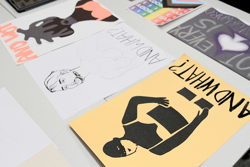
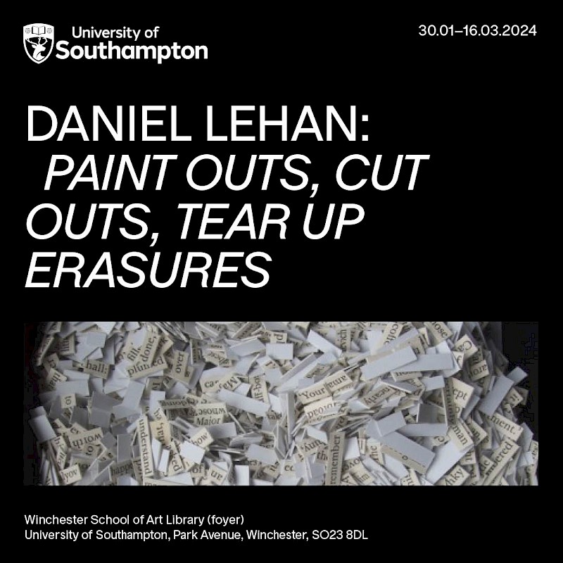
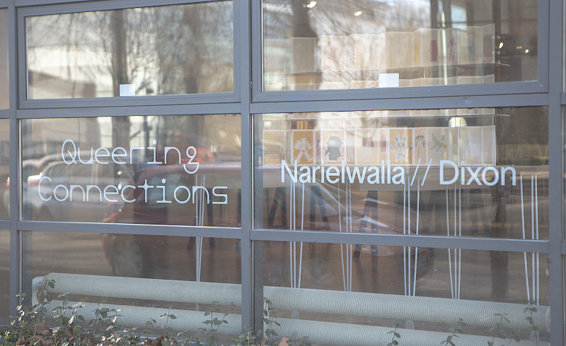
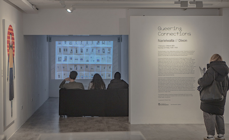
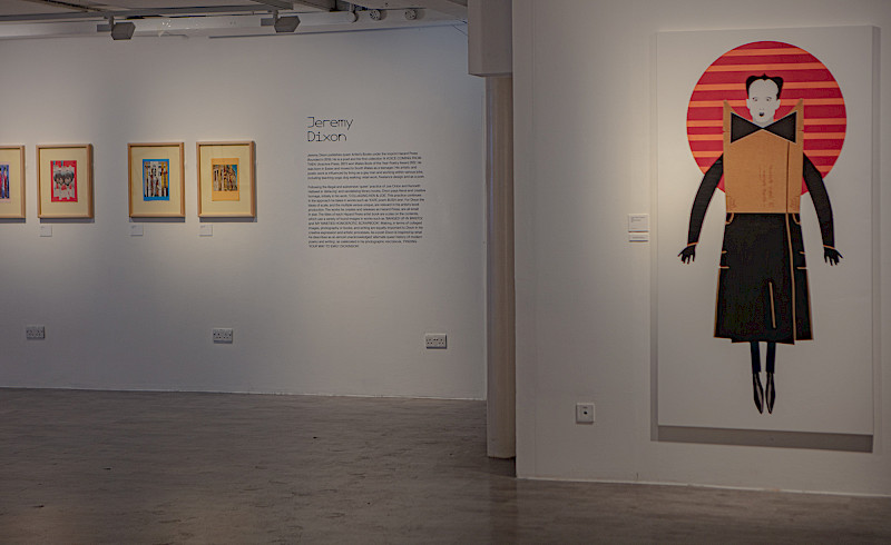
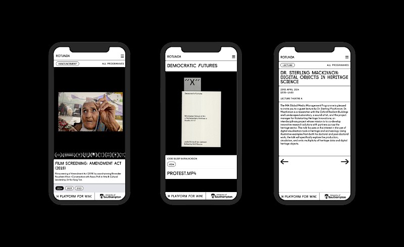
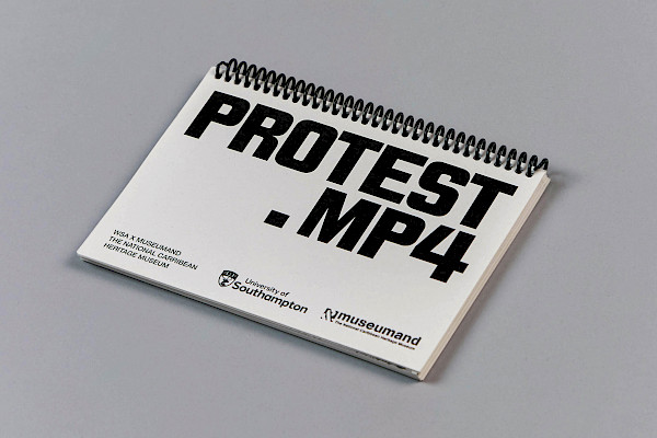
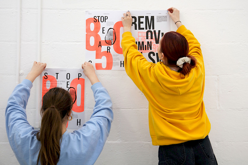
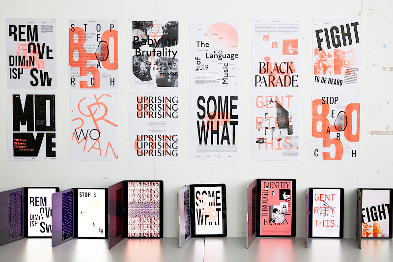
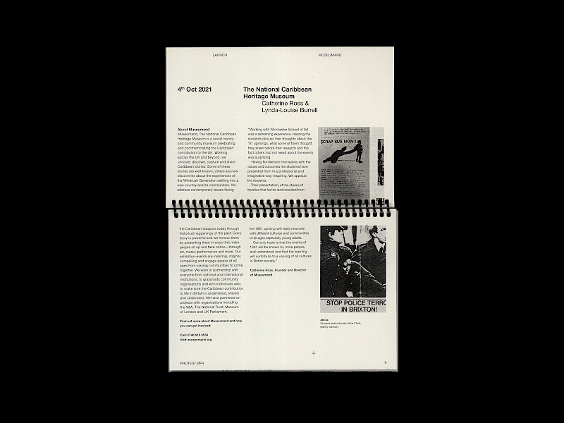
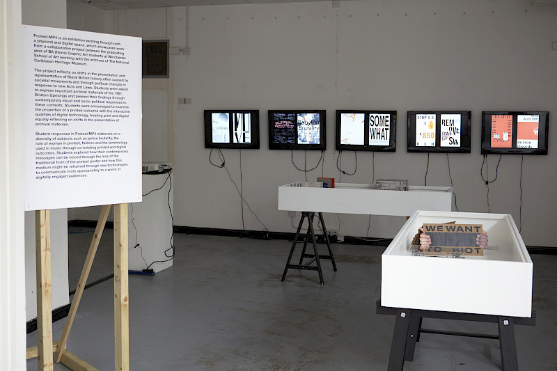
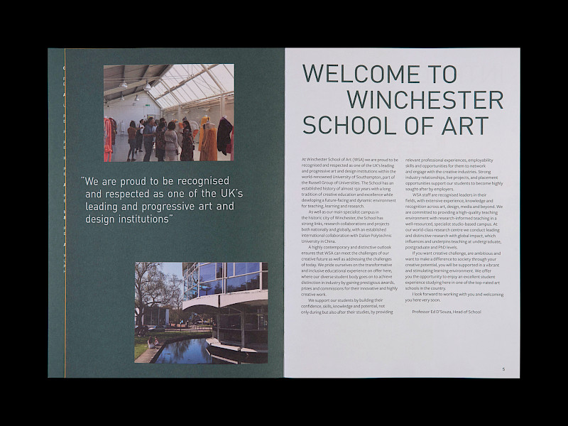
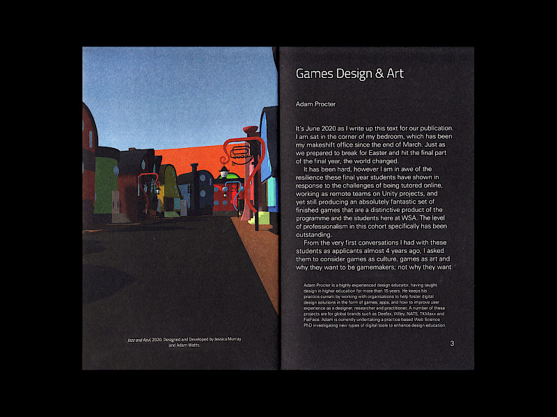
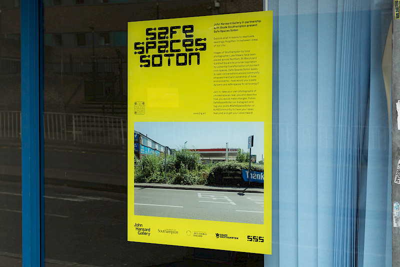
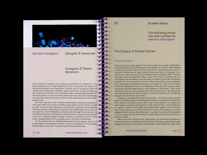
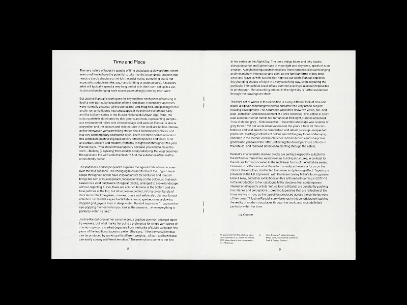
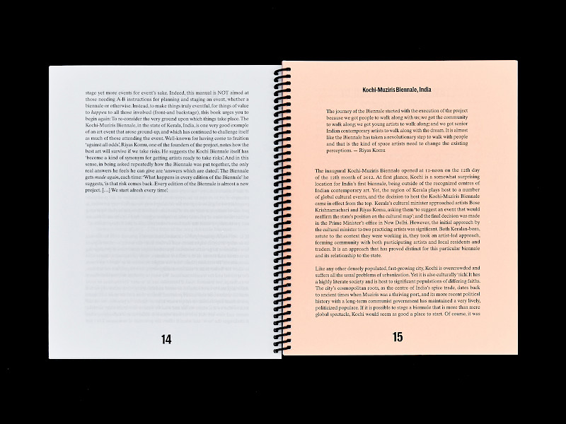
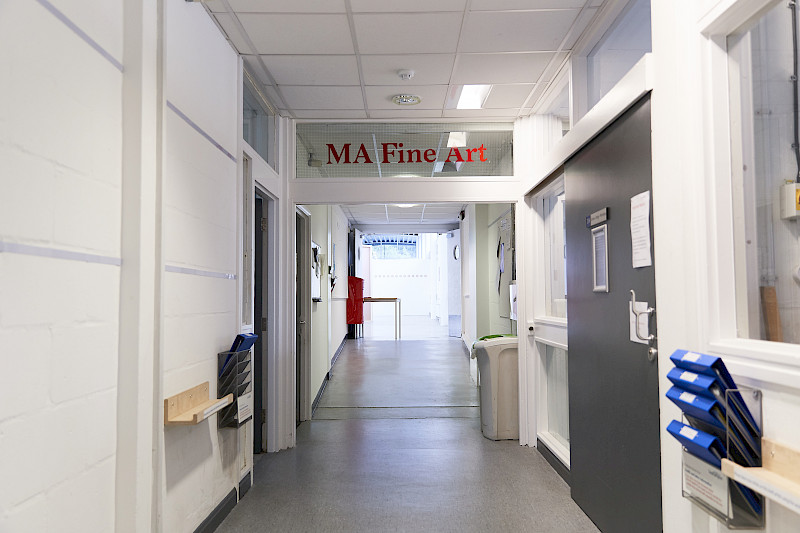
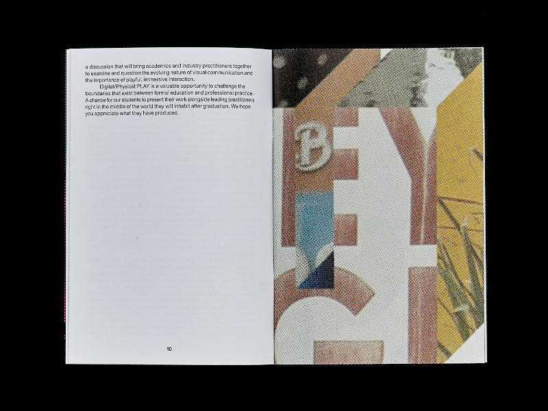
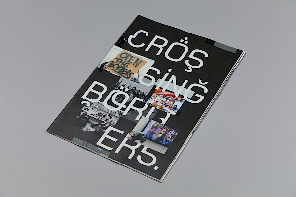
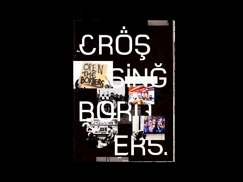
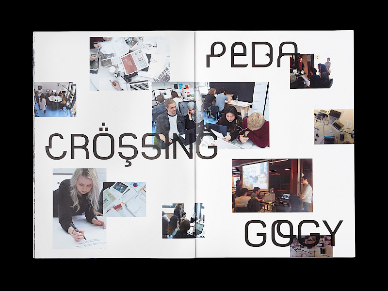
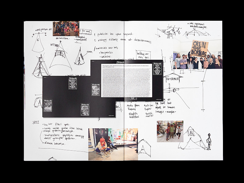
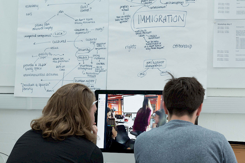
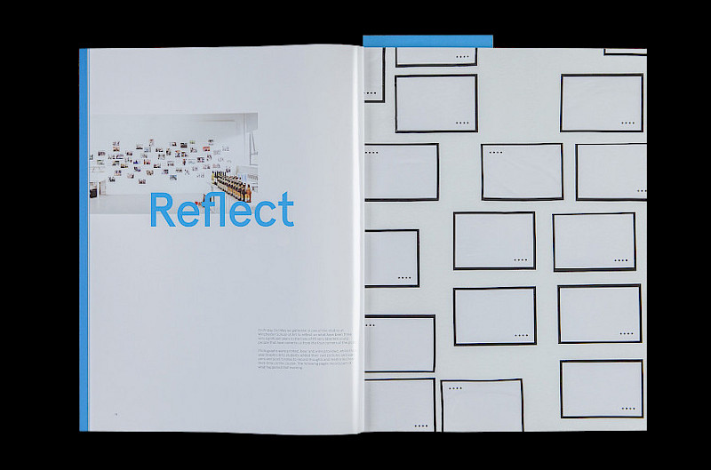
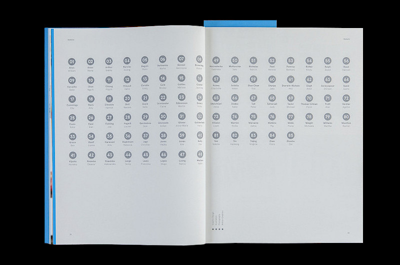
The Protest.mp4 collaborative student project was delivered in October 2021, the year of the 40th anniversary of the 1981 Brixton Uprisings. Studio 3015 used this opportunity raised by this anniversary to develop and lead a collaborative project with the purpose of revisiting this important British event and to connect current interests in race and activism raised through more recent global protests, led by the Black Lives Movement, to continued issues of racial disparity. Studio 3015 chose to work outside of the national archives that exist but made the decision to highlight the work of Museumand, The National Caribbean Museum as an example of a progressive British institution and archive to create a project that might tangibly engage with these linked histories and issues. Bringing BA (Hons) Graphic Arts students both into contact with historic material and an organisation that is really focused on supporting engagement with Black British history and culture is also about illustrating different ways that this student community might engage and participate in wider questions of culture, identity and how design might foster critical and useful societal engagement with these subjects. There of course within Museumand’s archive key documents and community produced political protest material directly relating to issues of racial discrimination raised through the Brixton uprisings and a project like this also seeks to allow the use of history to engage with what is a continued issue in contemporary Britain that our students can engage in. From these discussions students were encouraged to interpret the diverse social and political archival materials, primarily communicating a theme relating to the 1981 Brixton uprisings ensuring that they respect the content and context of the material, the voices of those involved and its place in history.
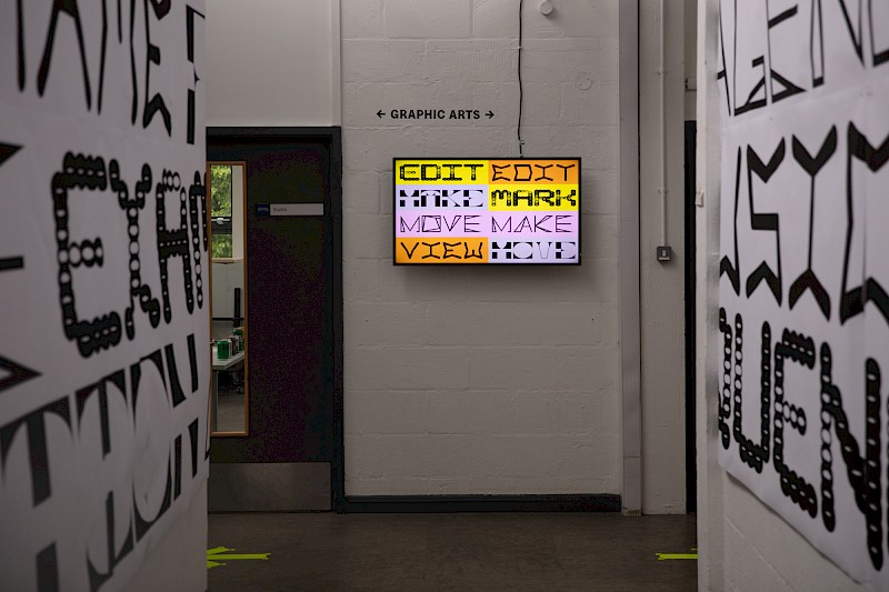
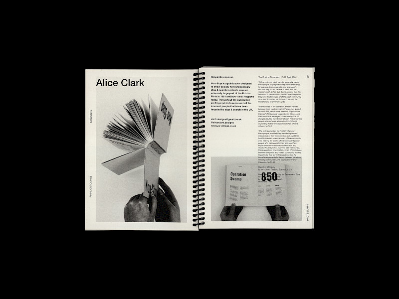
The students were encouraged to explore a range of visual approaches considering context, historic and contemporary parallels, themes and audience. Protest.mp4 as a project space offered students the opportunities to think of their outcomes in various ways. This included the use of a speculative design approach to challenge the subject matter and material allowing for a space to imagine alternative and better futures. These speculative approaches importantly encompass digital spaces, new technologies, other alternatives methods of communication or engagement beyond the traditional confines of print. As an approach and through professionally supported workshops, students framed responses around key words such as interpret, agitate, inform, solve or reveal.
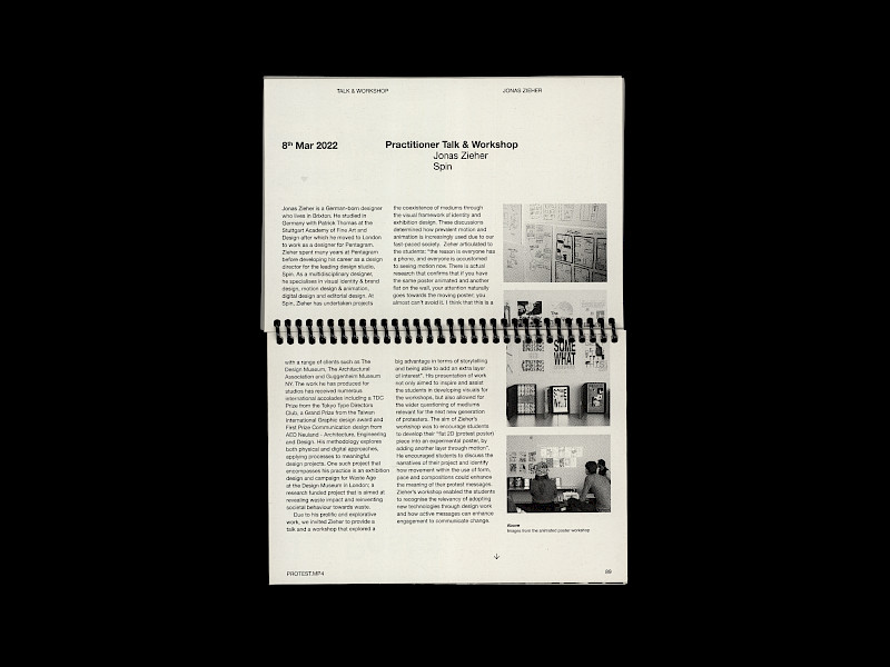
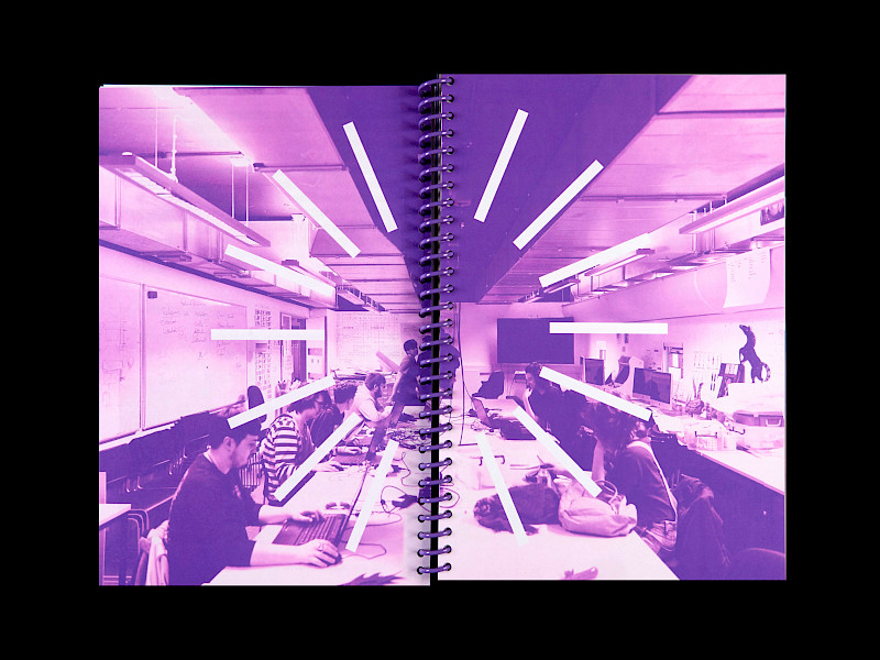
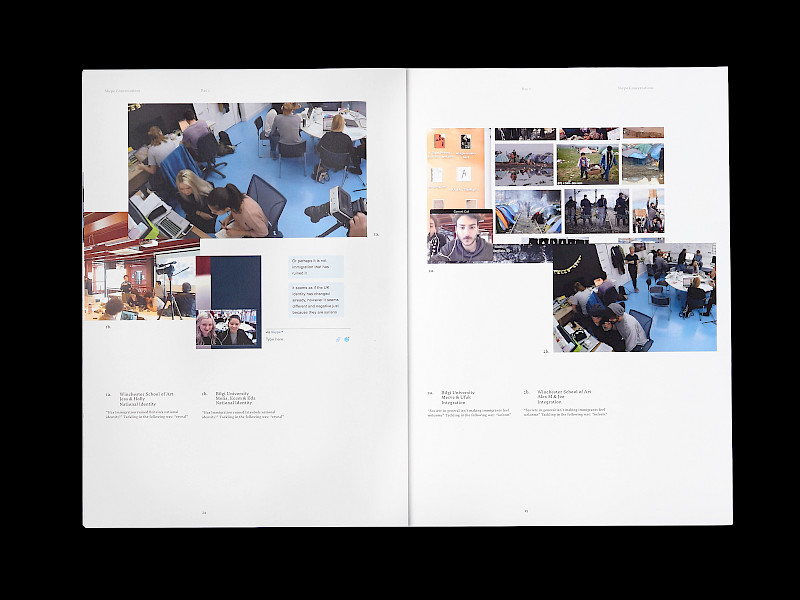
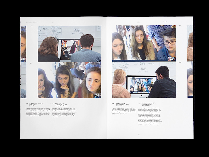
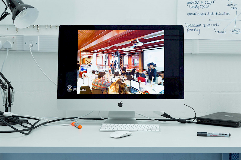
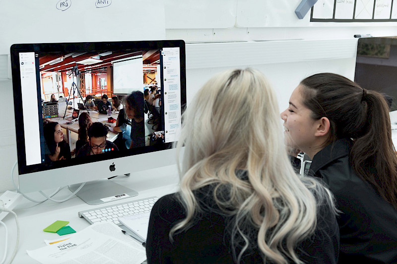
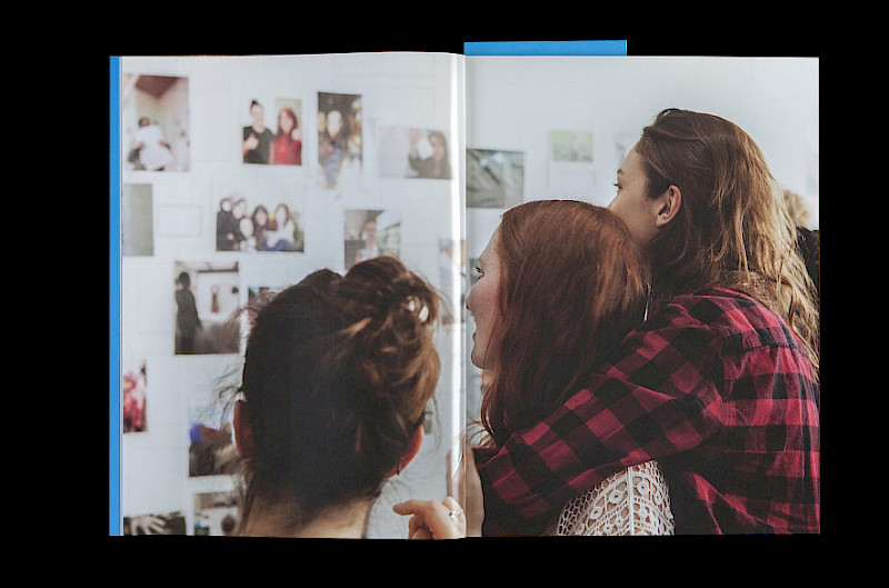
The process of collaboration was fundamental for students to create informed conversations whilst utilising the practising skillsets of the Graphic Arts cohort. Working with Museumand —The National Caribbean Heritage Museum, Eddie Opara—Pentagram, Kieron Lewis, Jona Zieher—Spin and Studio 3015—WSA, allowed for the contribution of their perspectives of race, diversity, speculative practice, technology and activism. Through the generous support of these professional contributors, the students greatly enhanced their understanding of these subjects and independently sought alternative approaches to challenge norms.
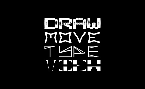
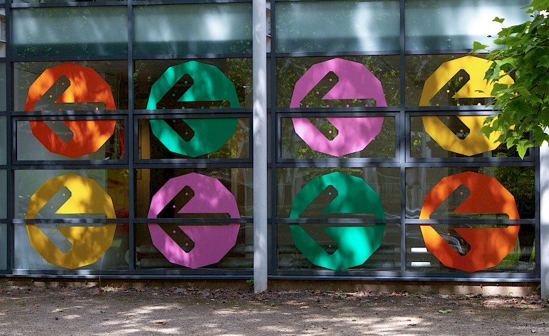
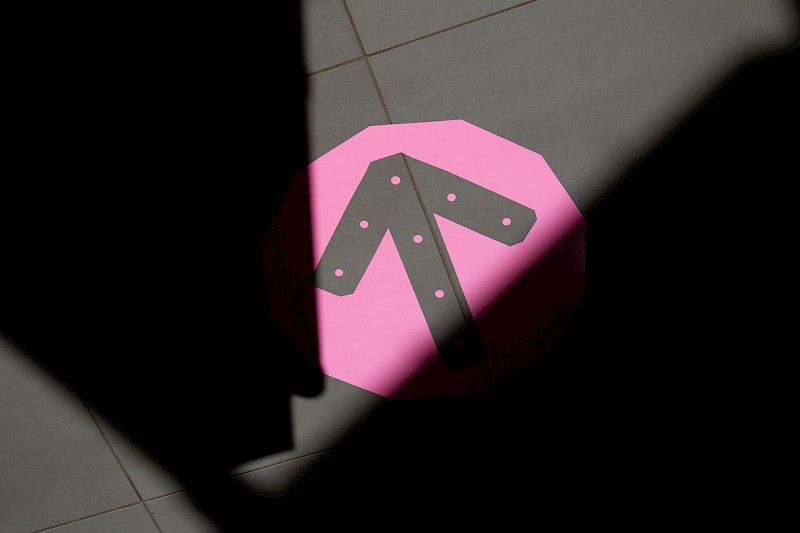
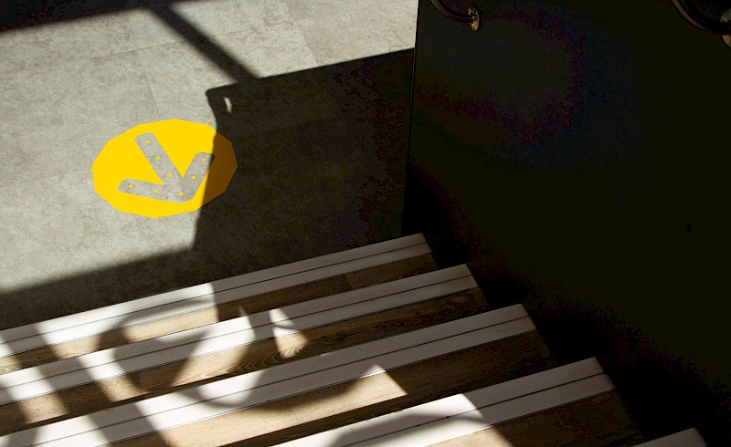
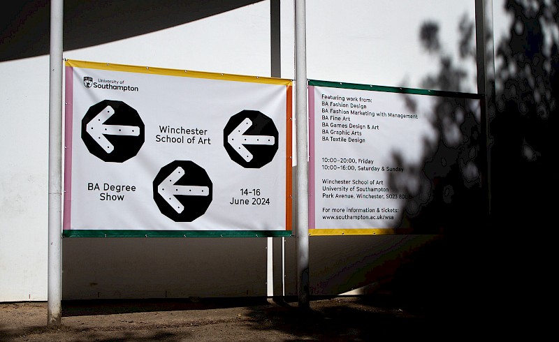
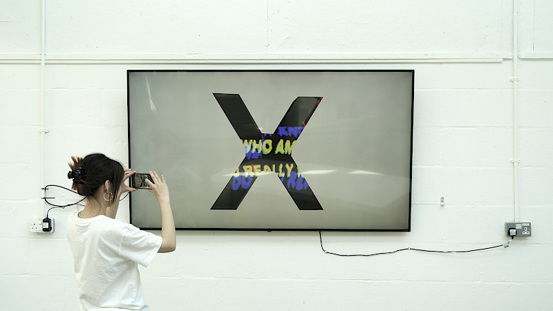
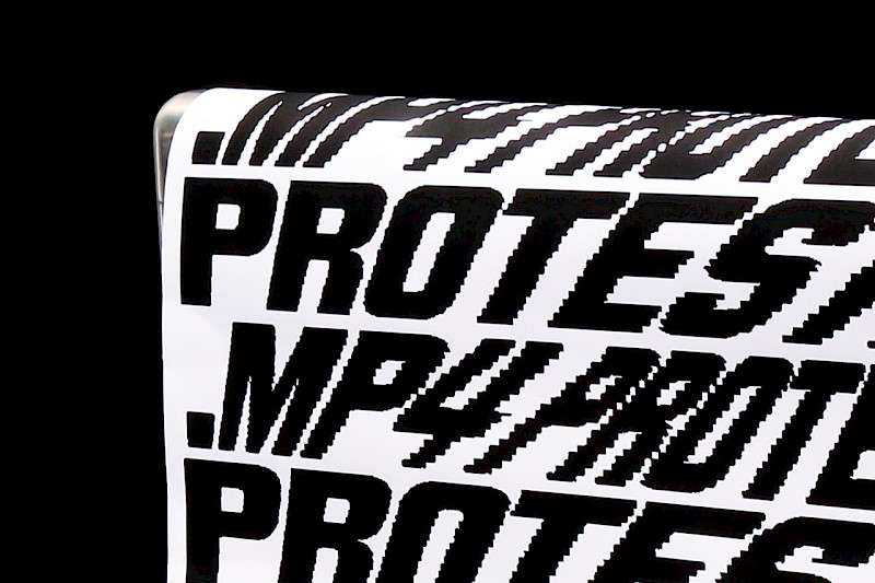
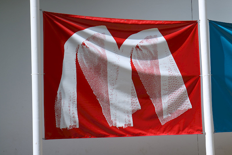
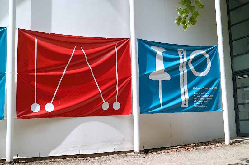
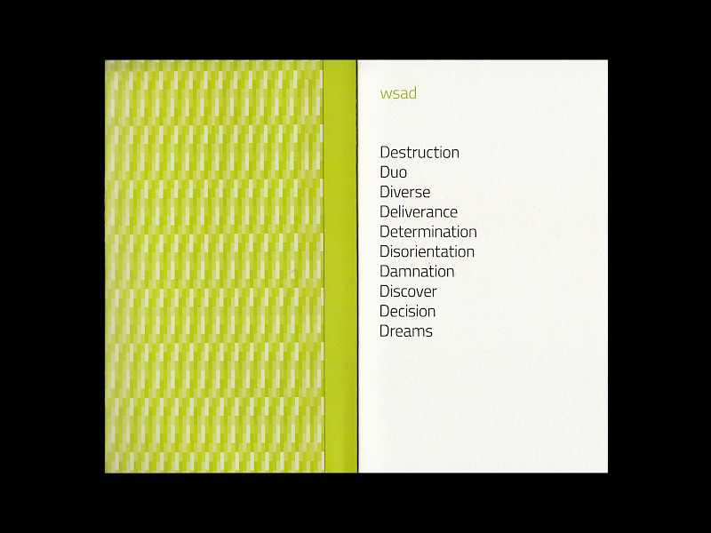
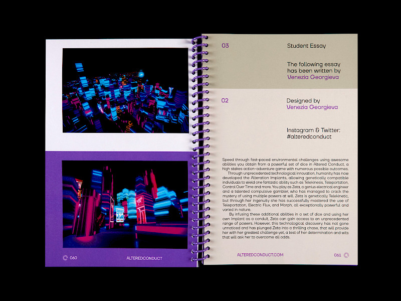
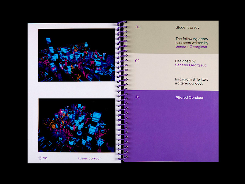
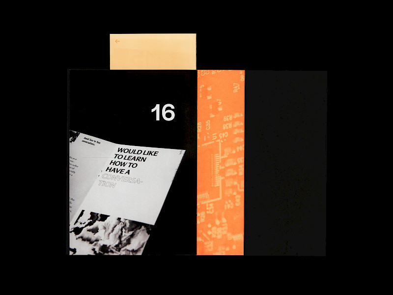
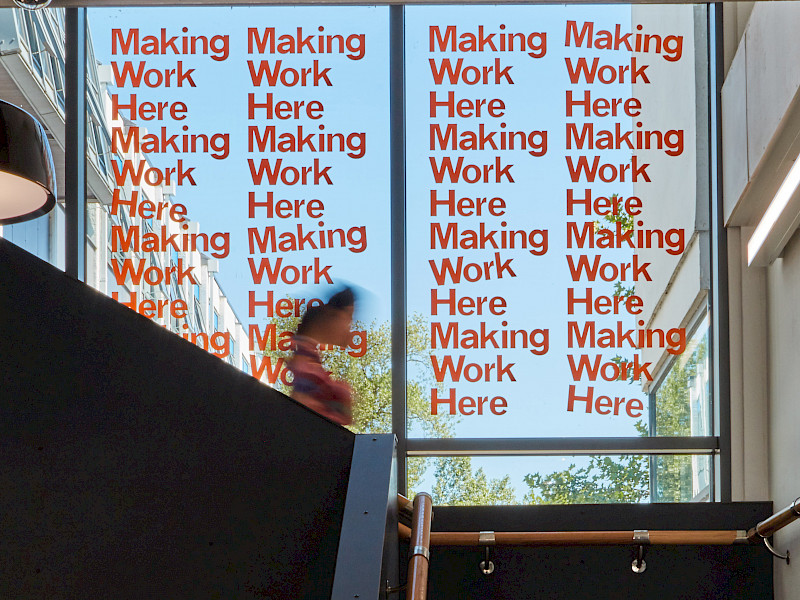
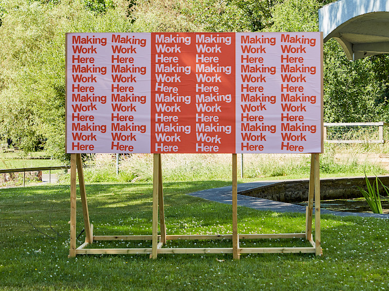
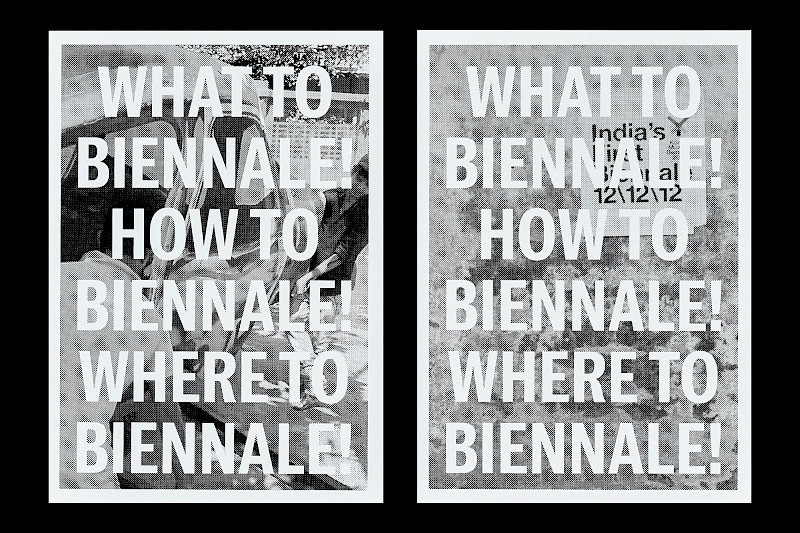
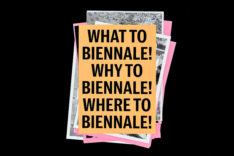
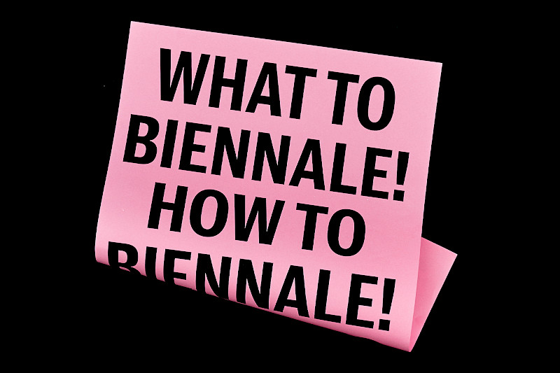
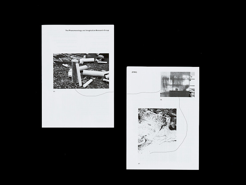
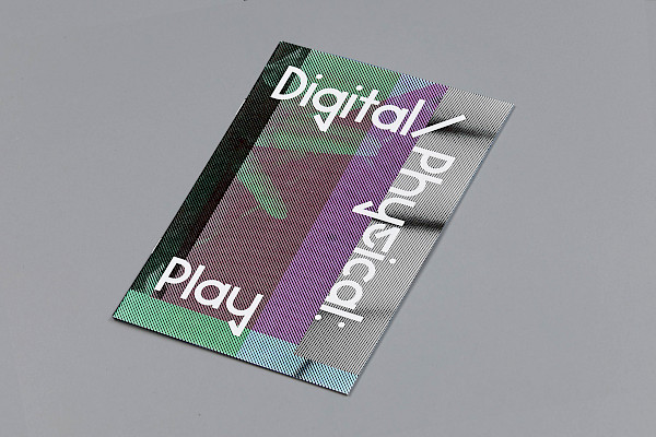
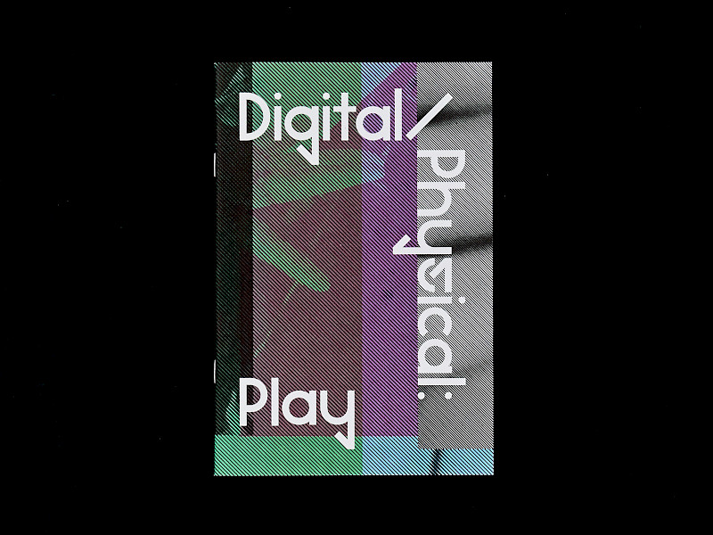
Students worked under the guidance of Studio 3015 in a studio setting to create an identity system that communicated the key principles of Protest.mp4. They investigated and demonstrated how their messages could be communicated through the lens of traditional forms of protest, and queried how this medium can be challenged through new ways of thinking and designing. The expansion of new technologies has altered the landscape of design and how communication is perceived and experienced. Questioning the role of the poster and how this can be pushed beyond the boundaries of the printed page would allow the medium to expand and serve as a unified coexistence in both a physical and digital space. Typography on the animated designs would be responsive and reactive, amplifying the mode of design activism to a contemporary audience. With a lack of diversity within the Graphic design industry, students wanted to employ a typeface that was representational of race, protest and its history. Designed by Tré Seal, Vocal Type, Neue Black typeface was a relevant identity choice for the project due to it design being grounded within civil right protest movements.
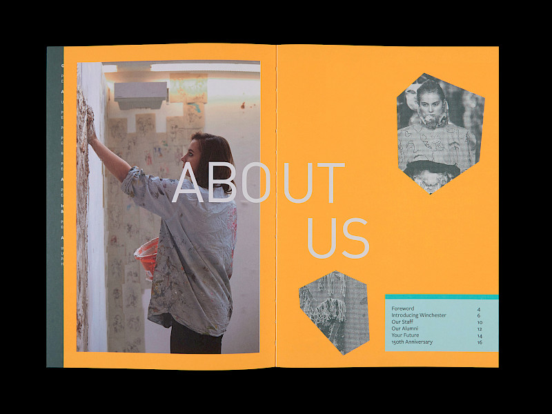
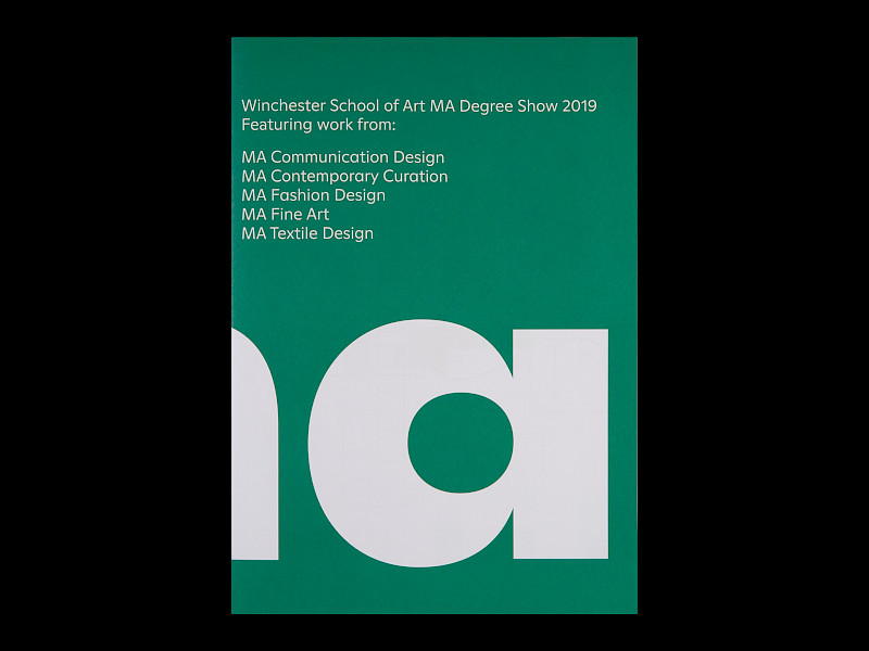
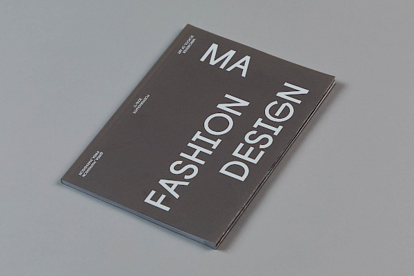
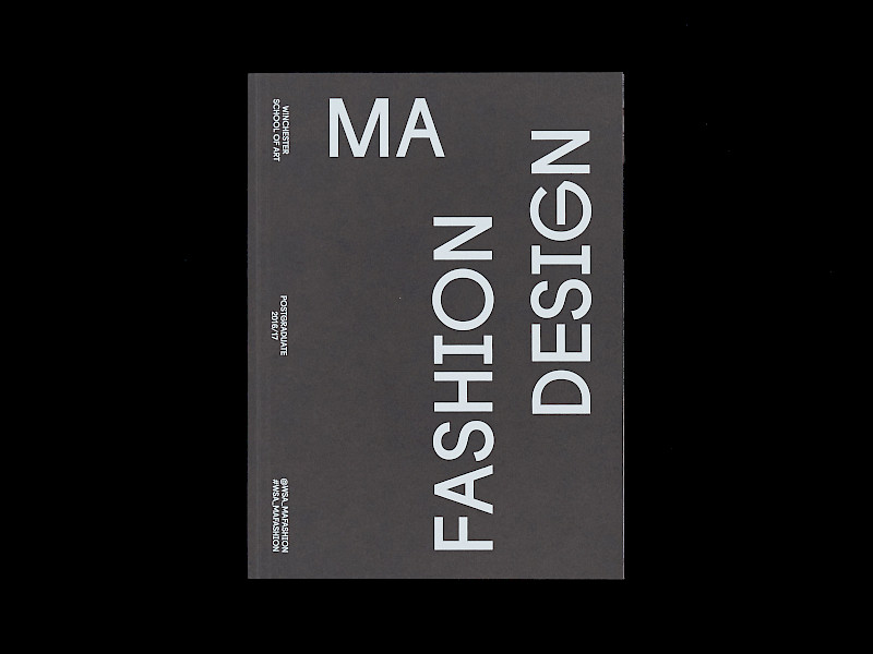
#: 0082
Year: 2022
Colour(s): Grey
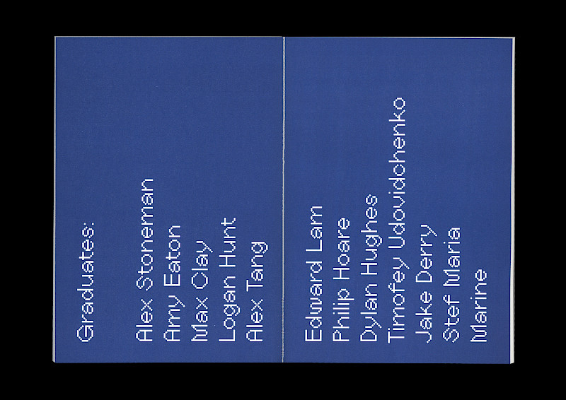
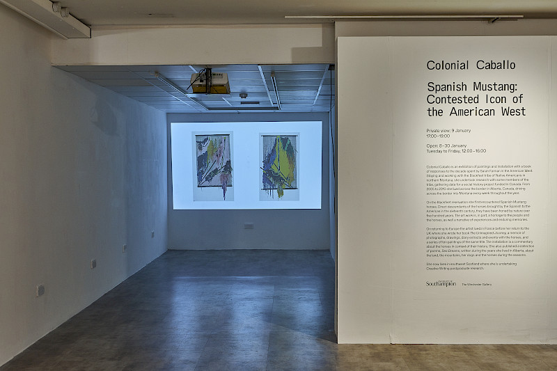
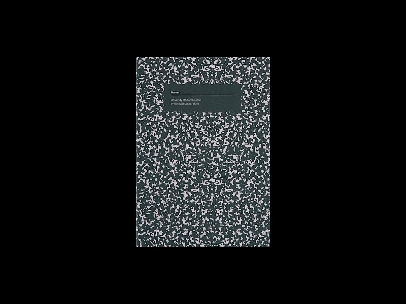
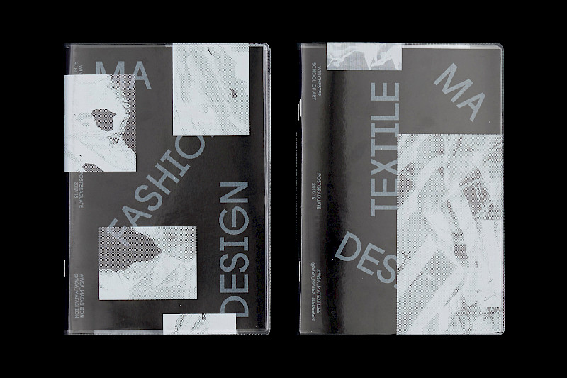
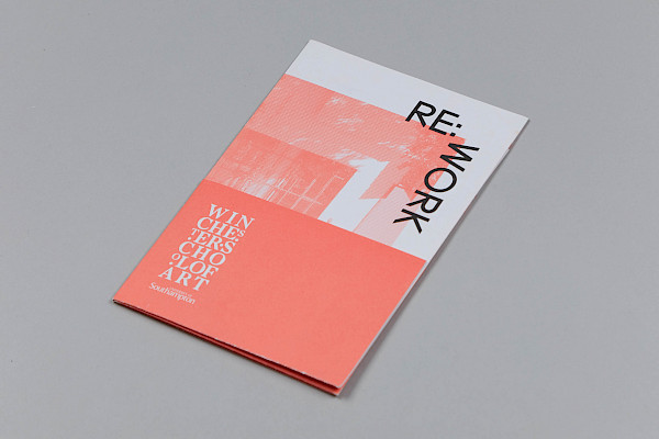
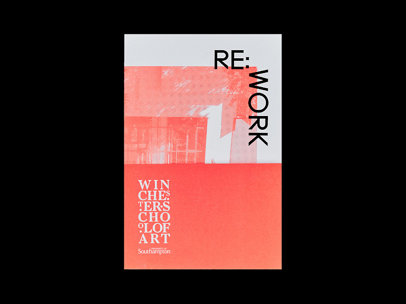
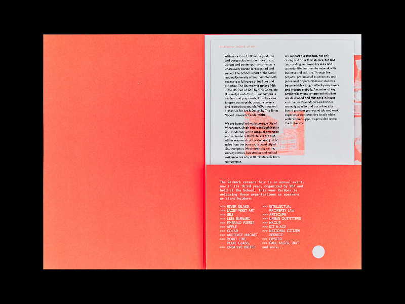
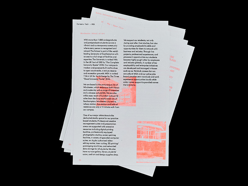
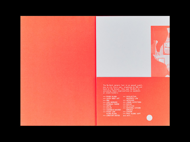
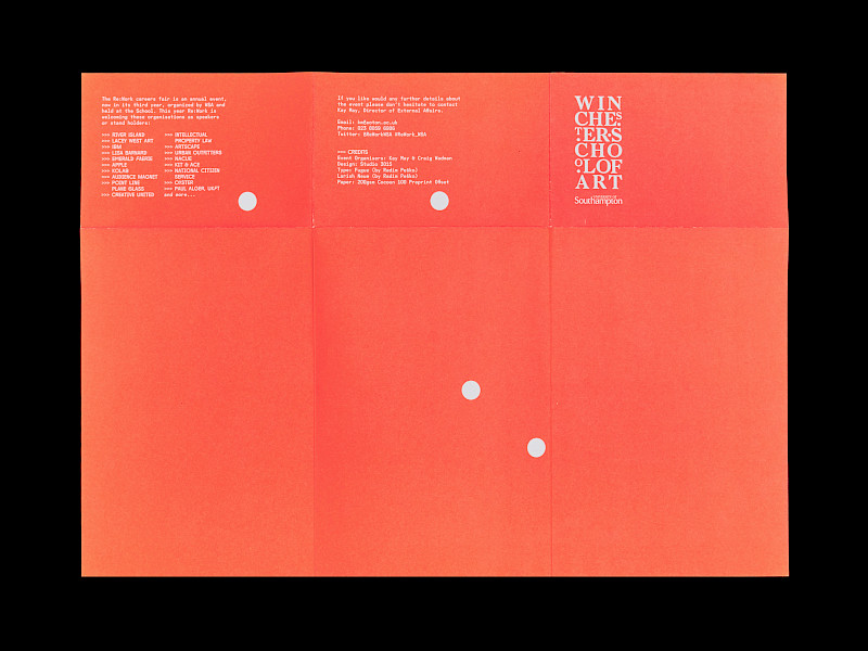
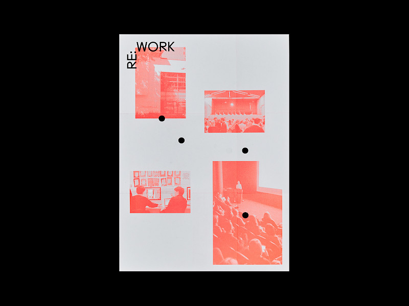
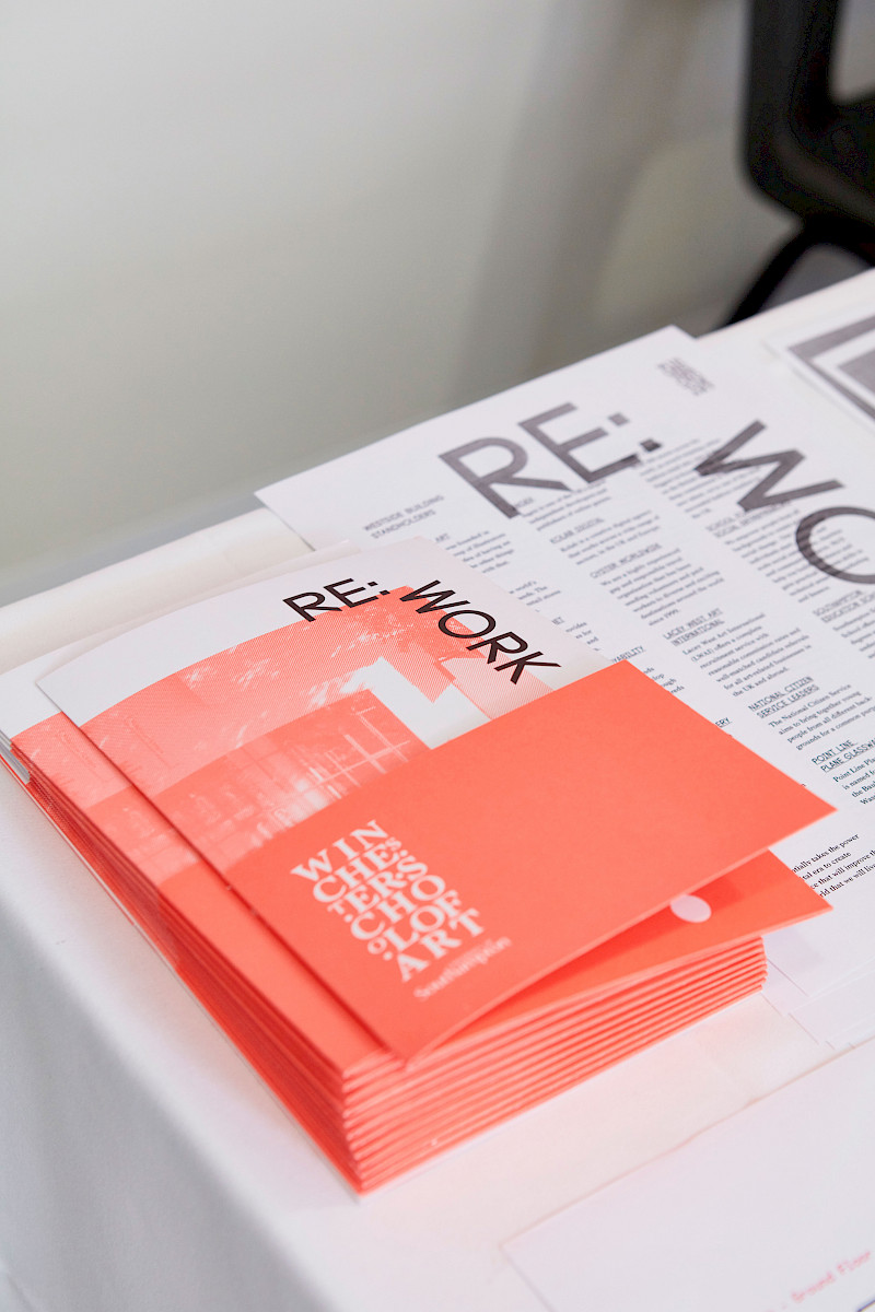
Client(s): BA Graphic Arts, Museumand, The National Caribbean Museum
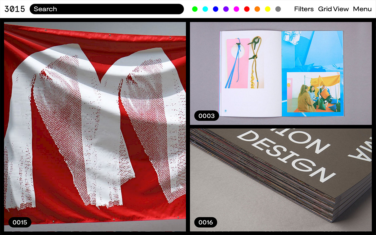
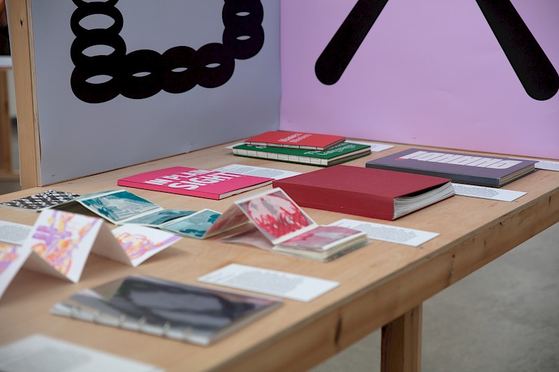
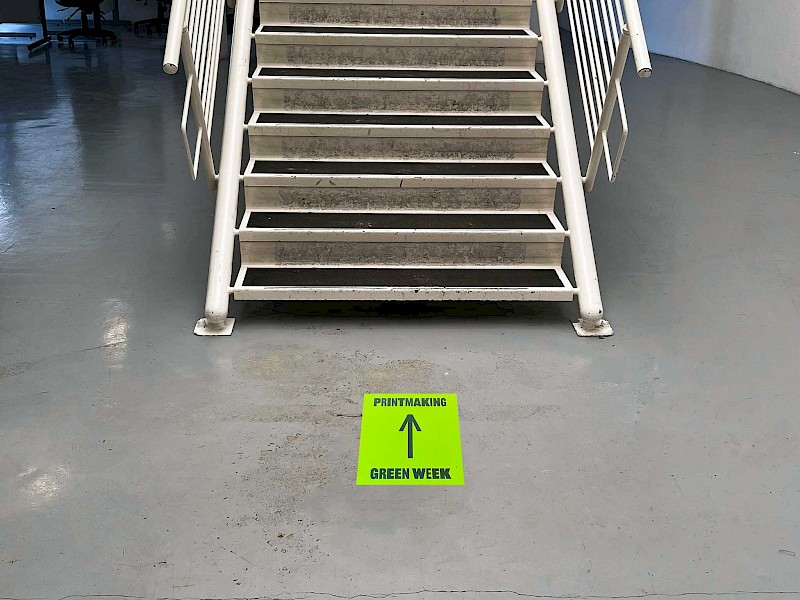
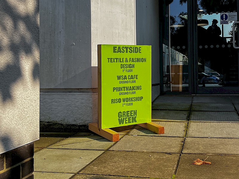
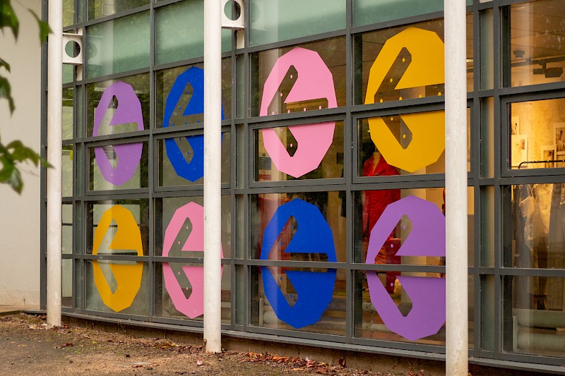
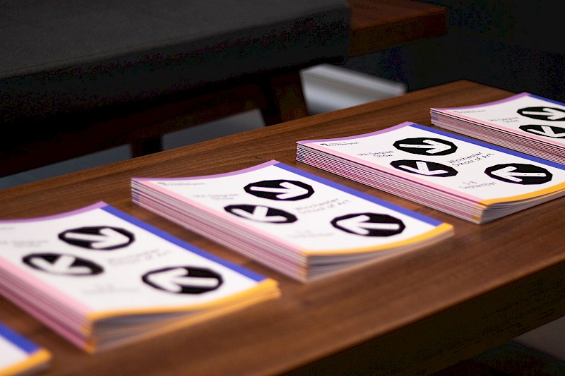
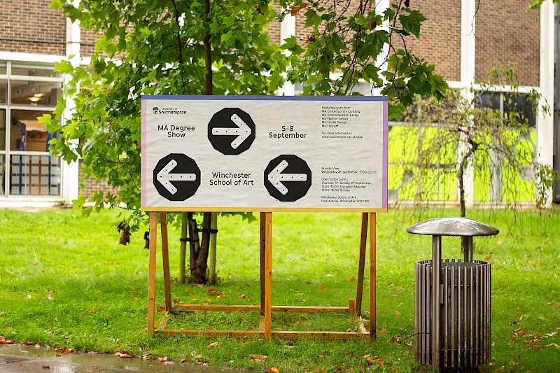
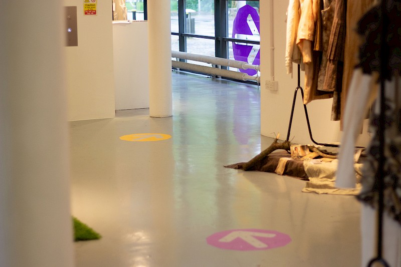
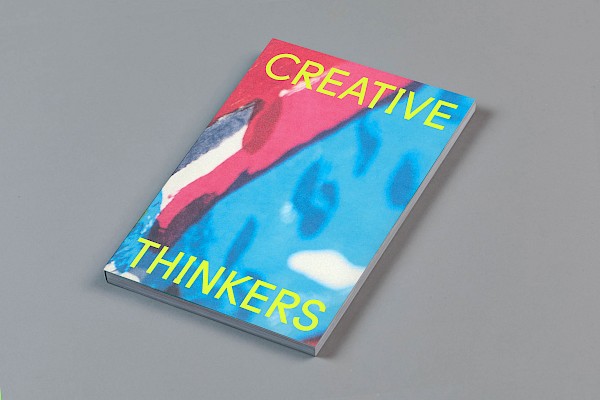
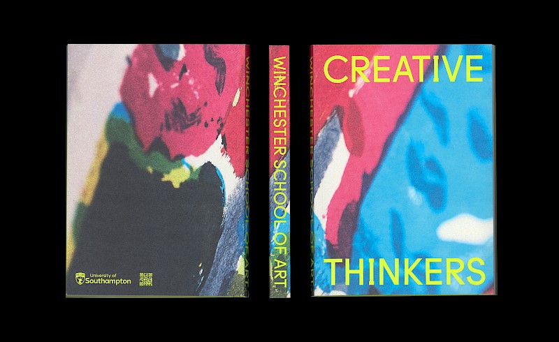
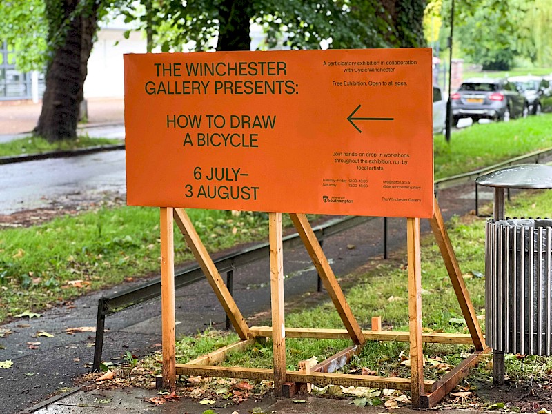
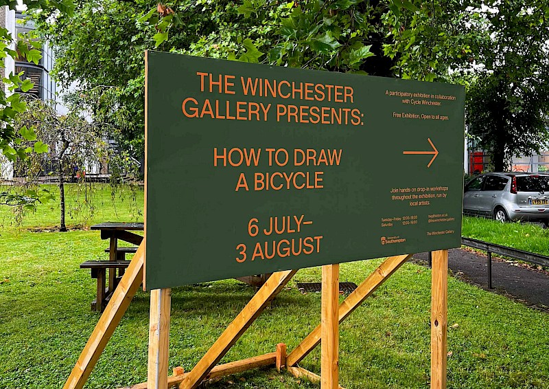
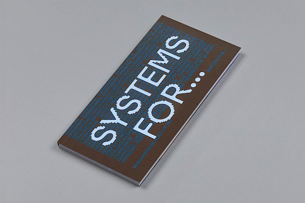
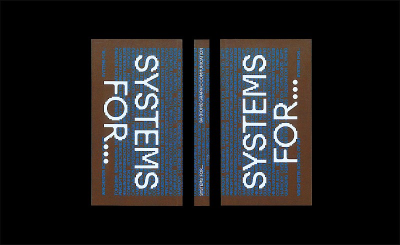
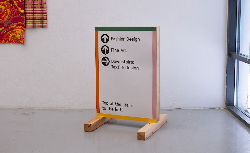
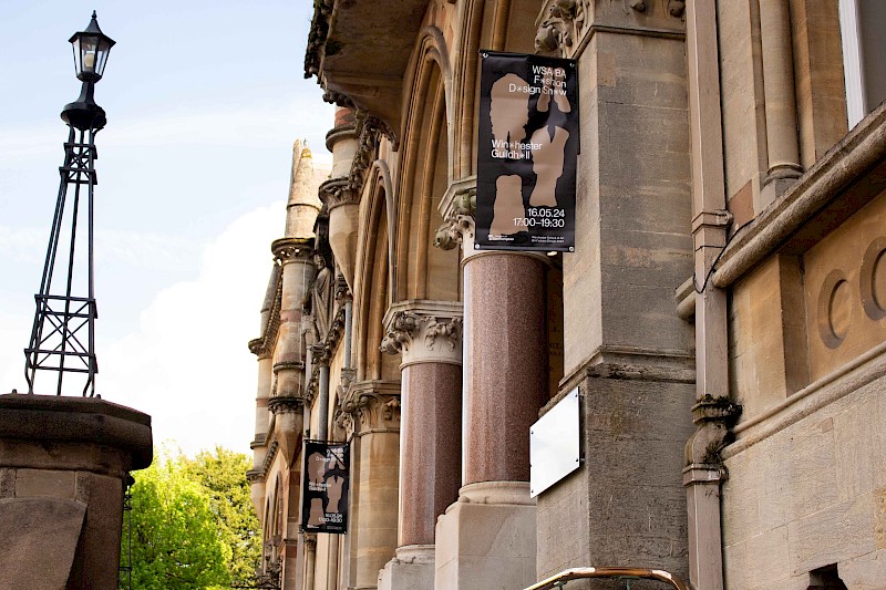
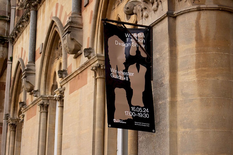
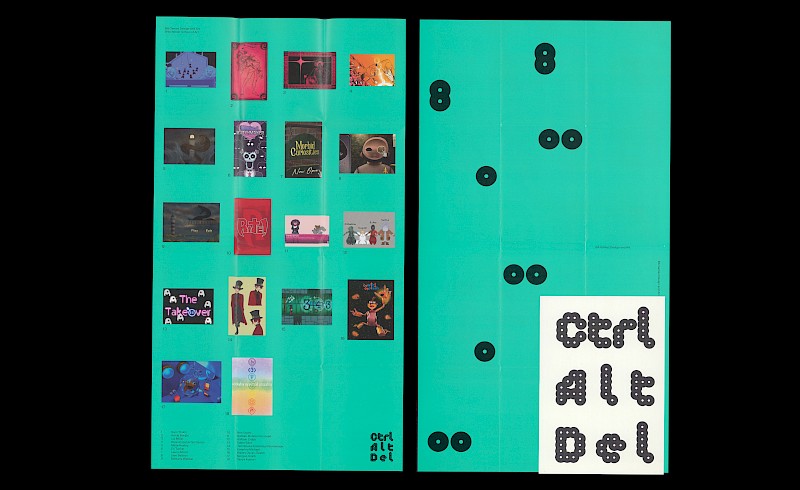
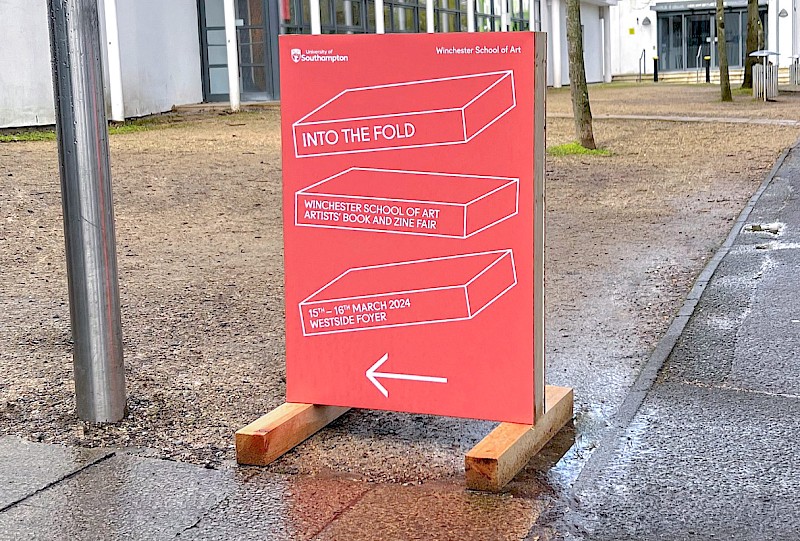
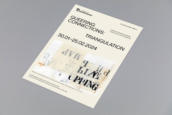
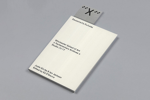
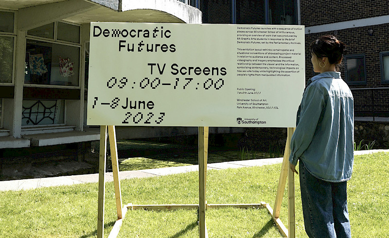
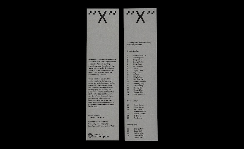
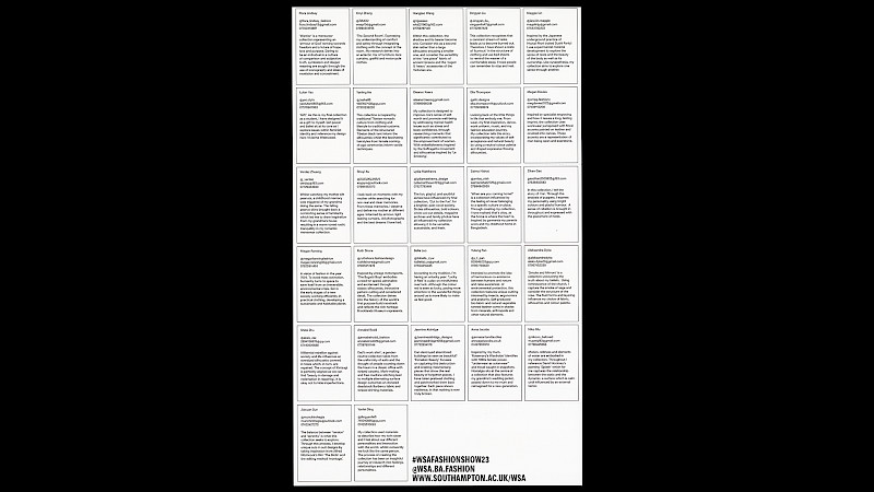
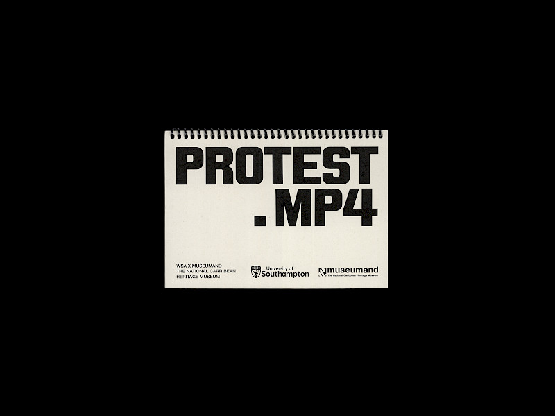
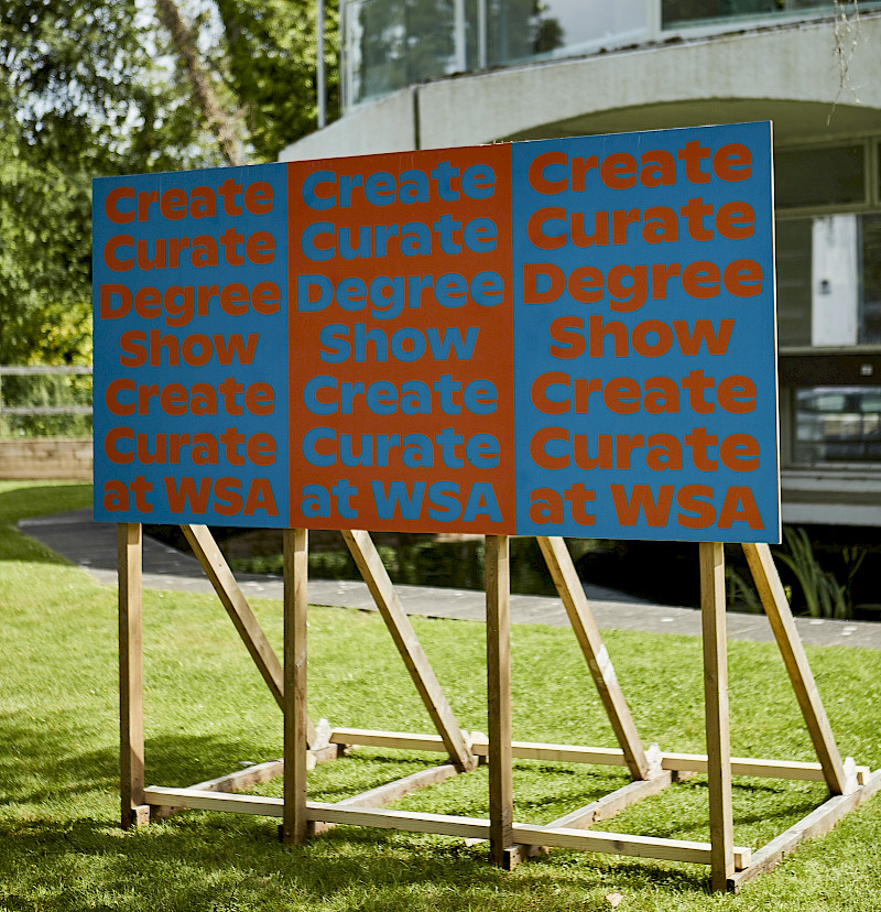
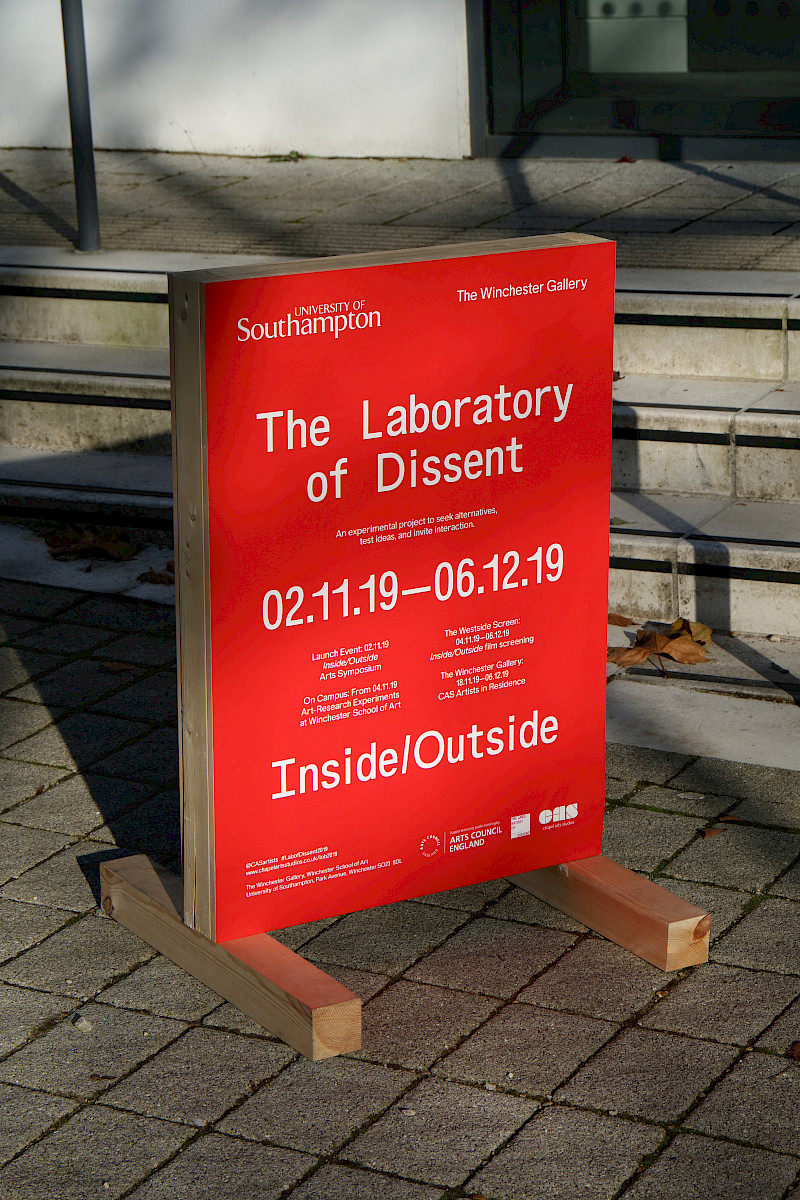
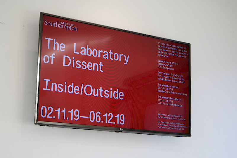
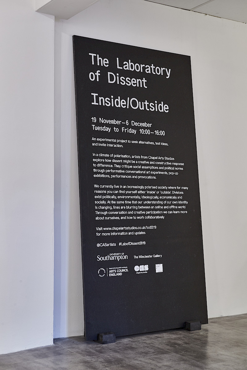
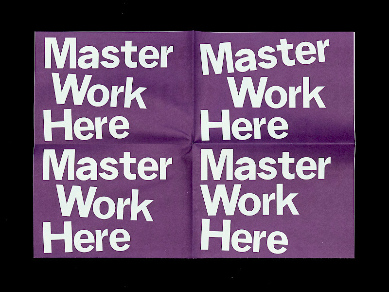
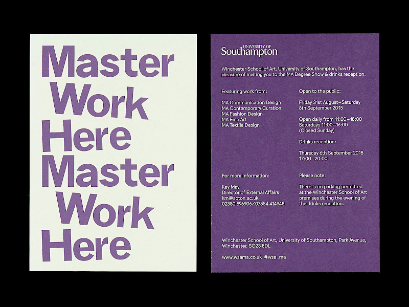
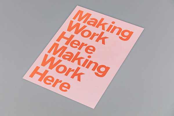
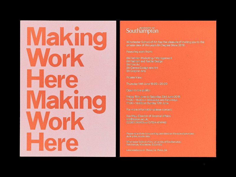
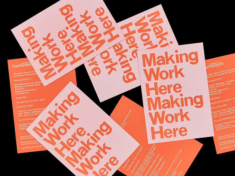
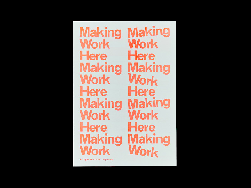
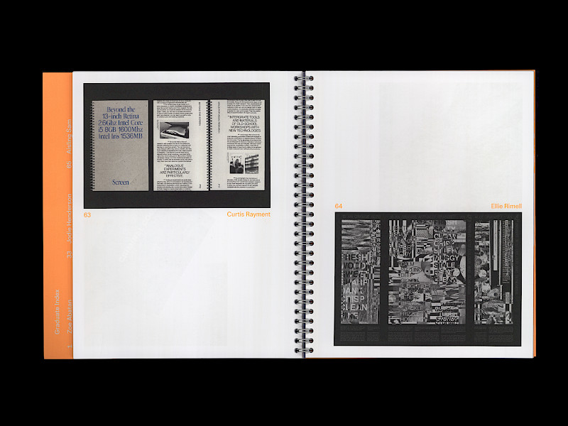
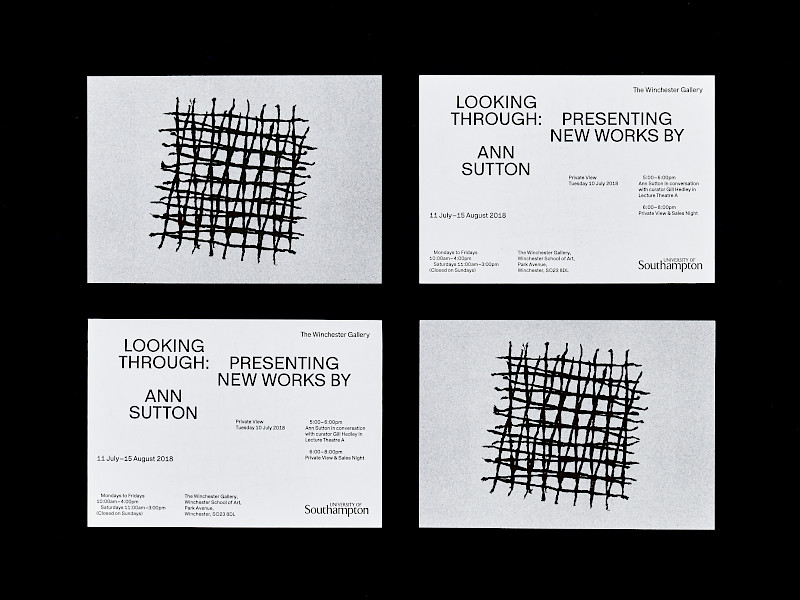
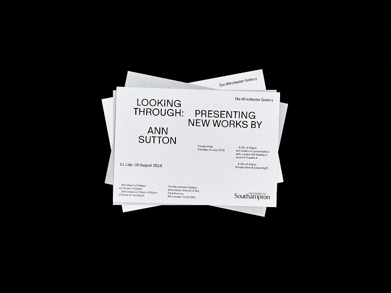
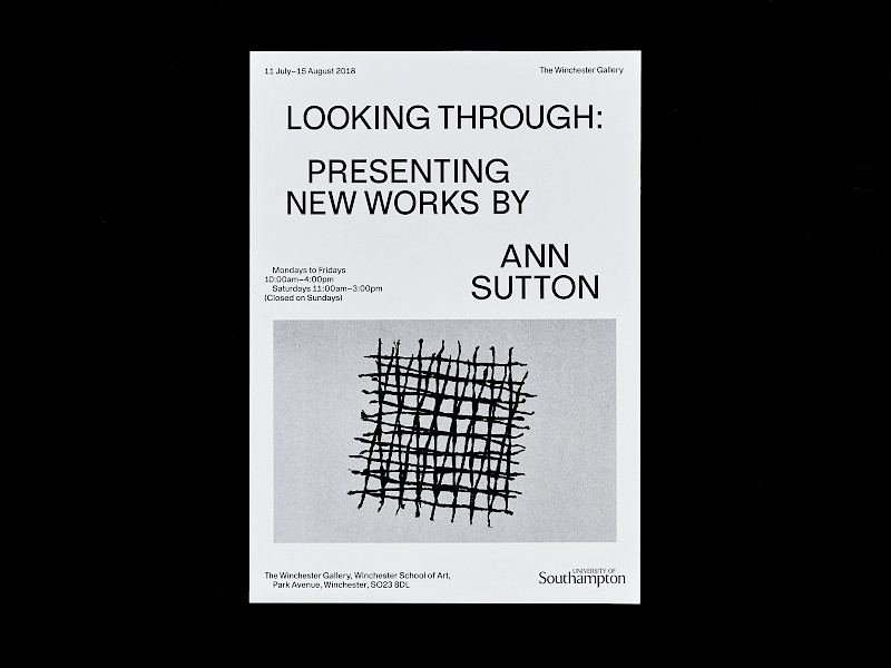
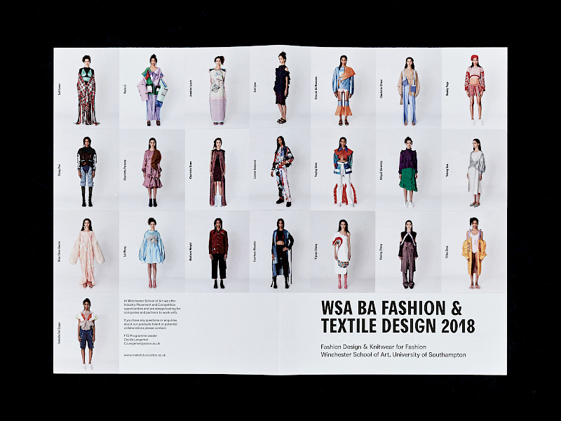
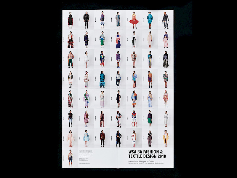
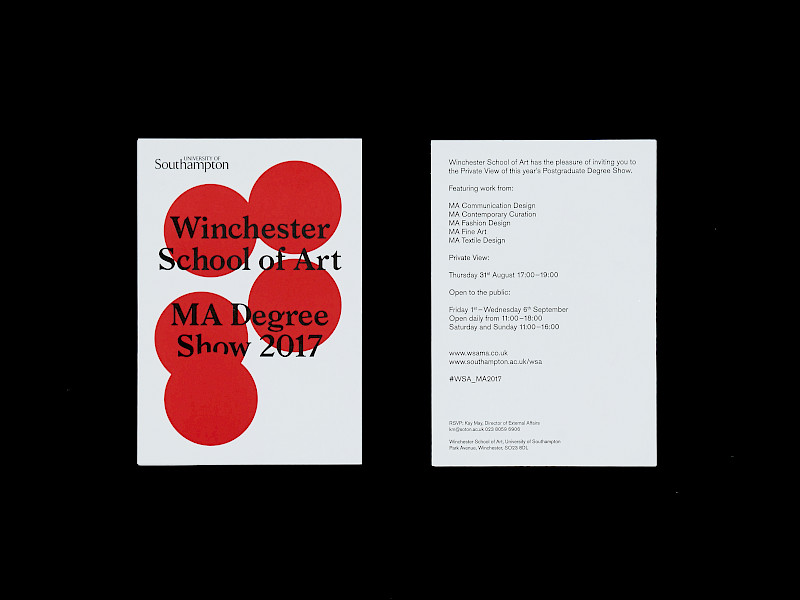
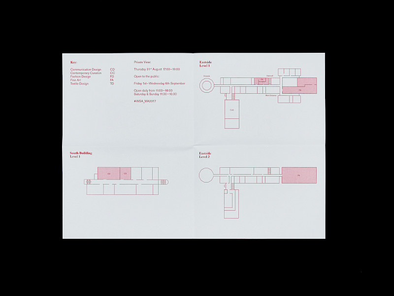
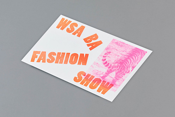
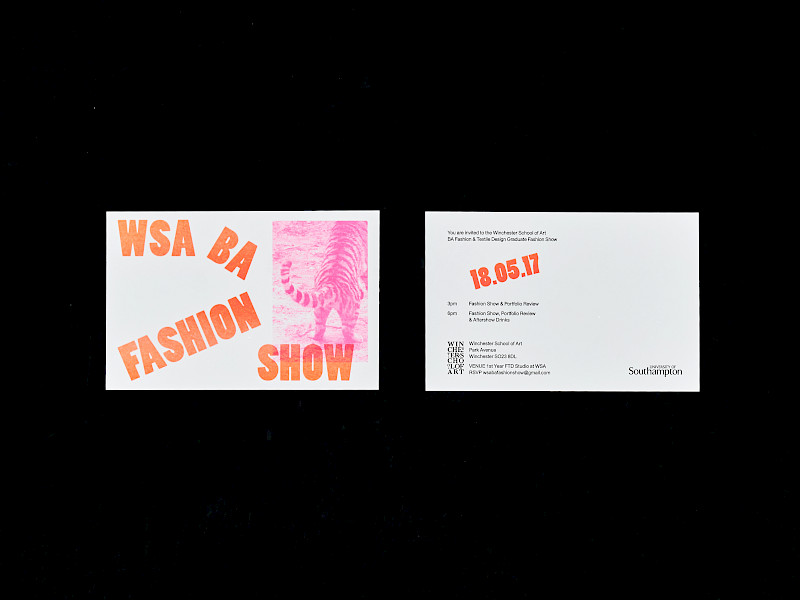
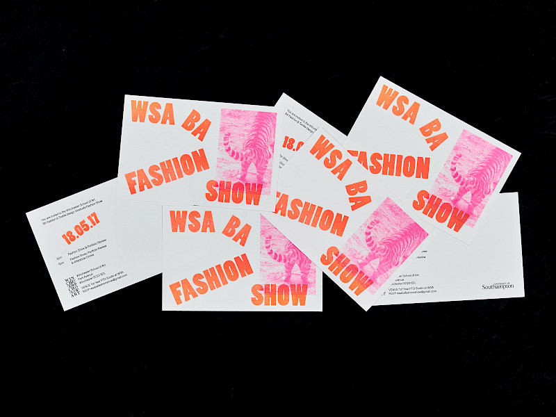
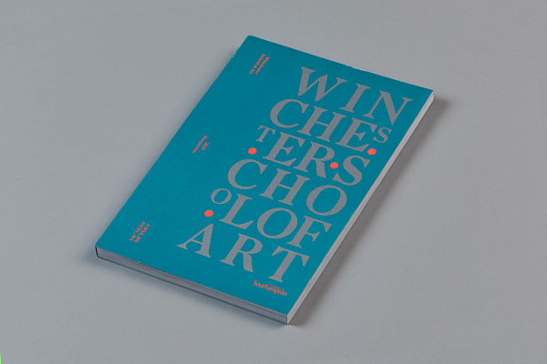
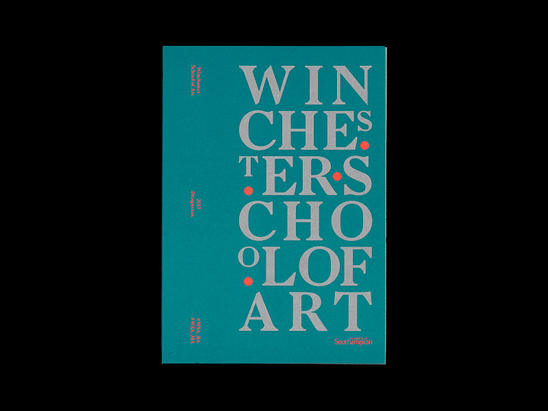
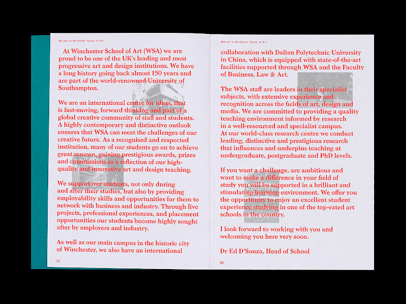
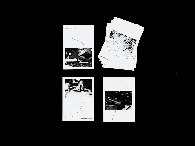
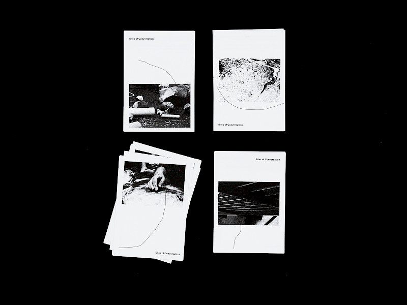
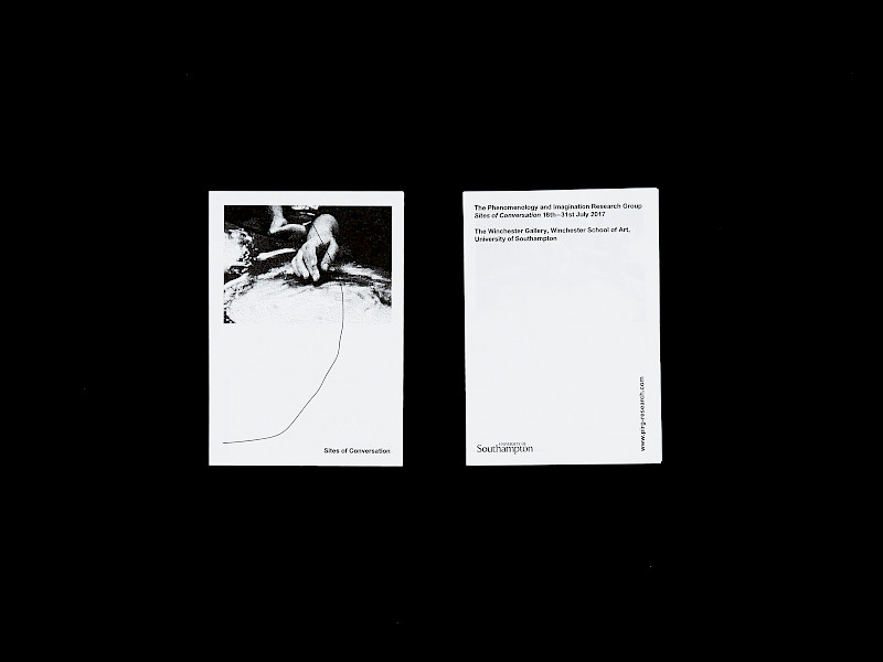
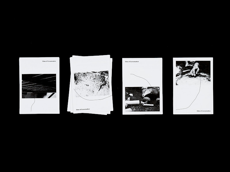
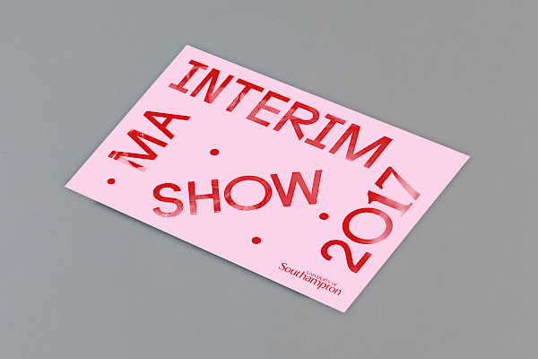
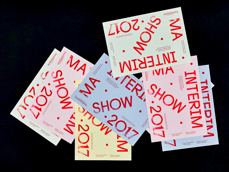
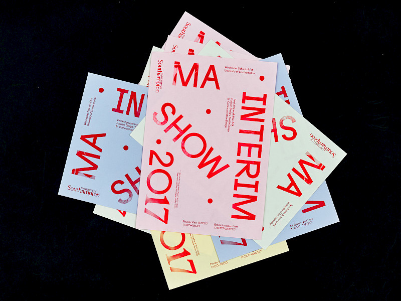
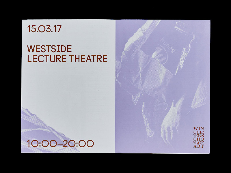
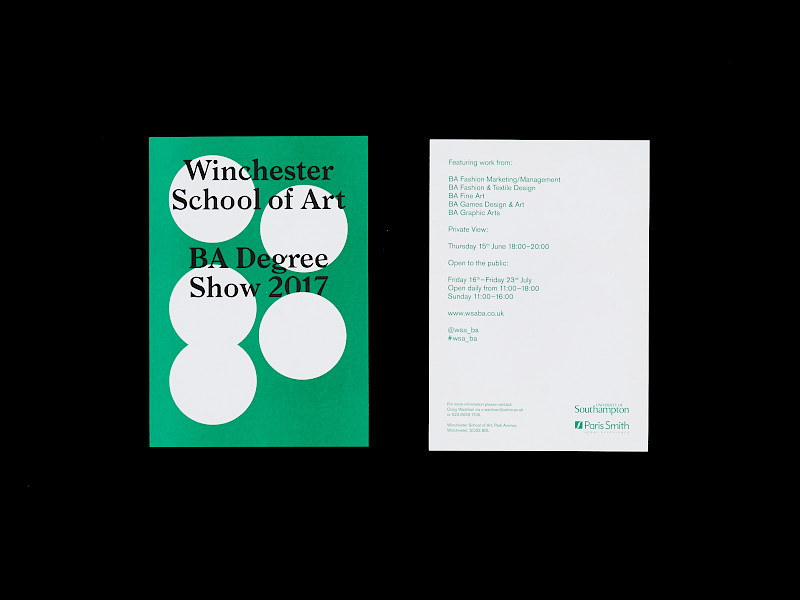
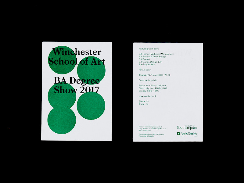
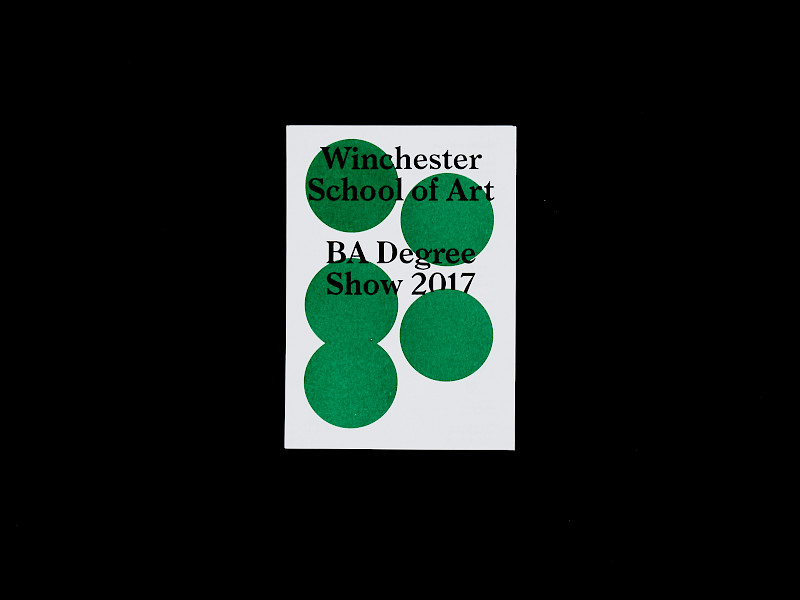
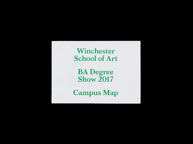
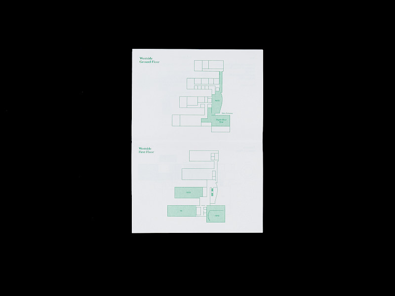
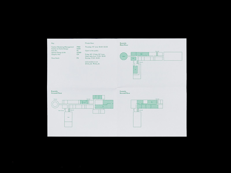
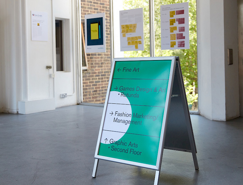
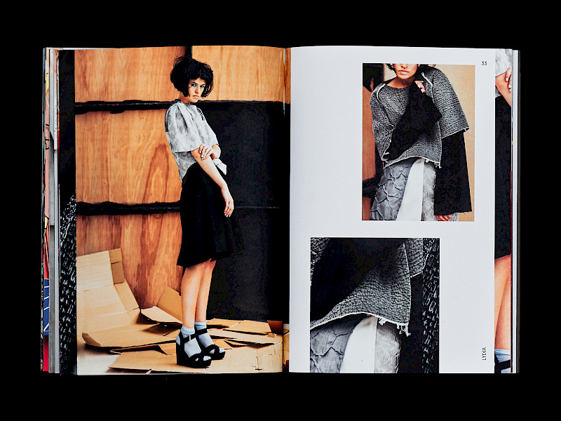
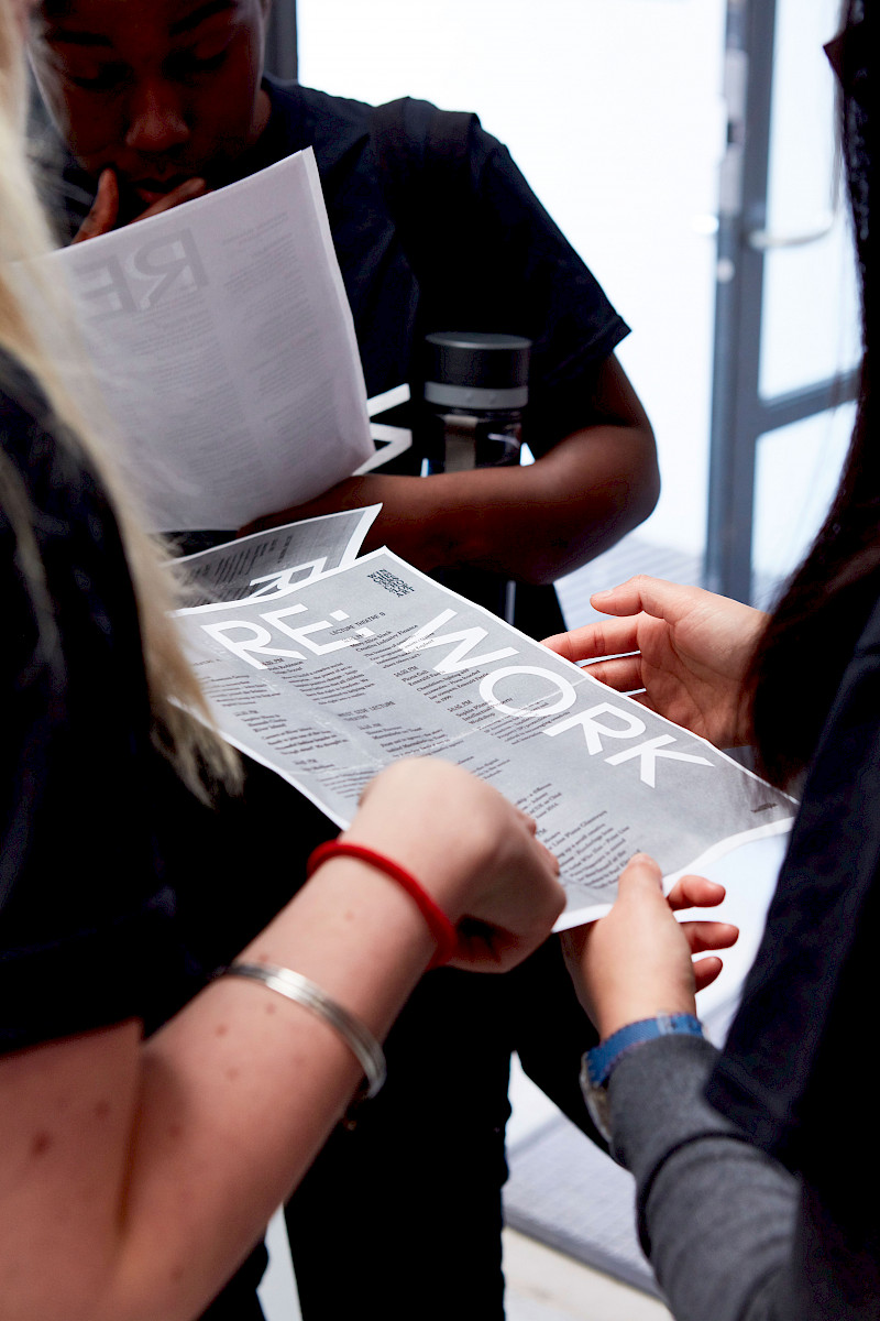
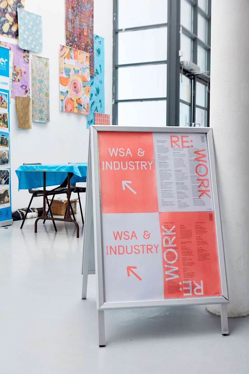
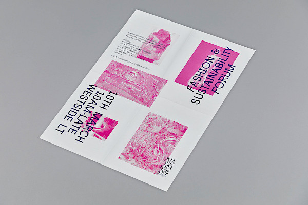
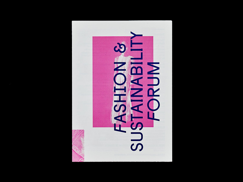
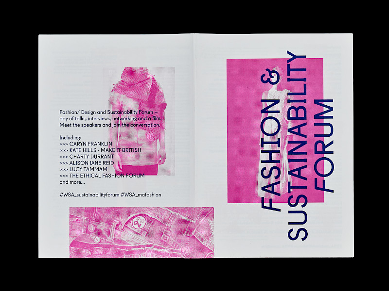
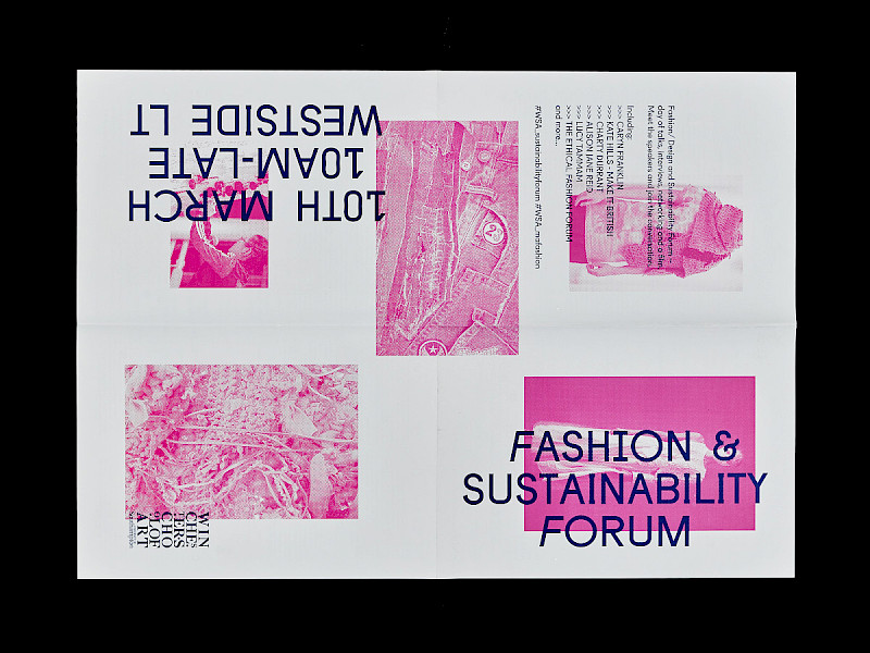
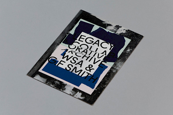
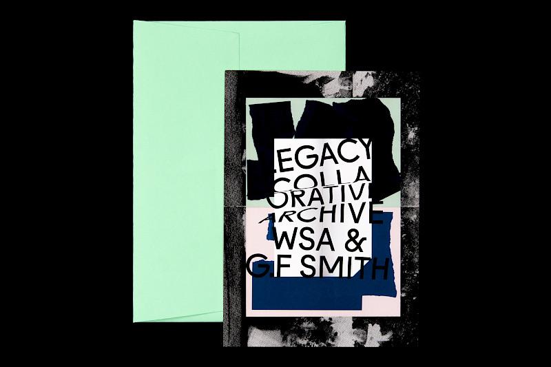
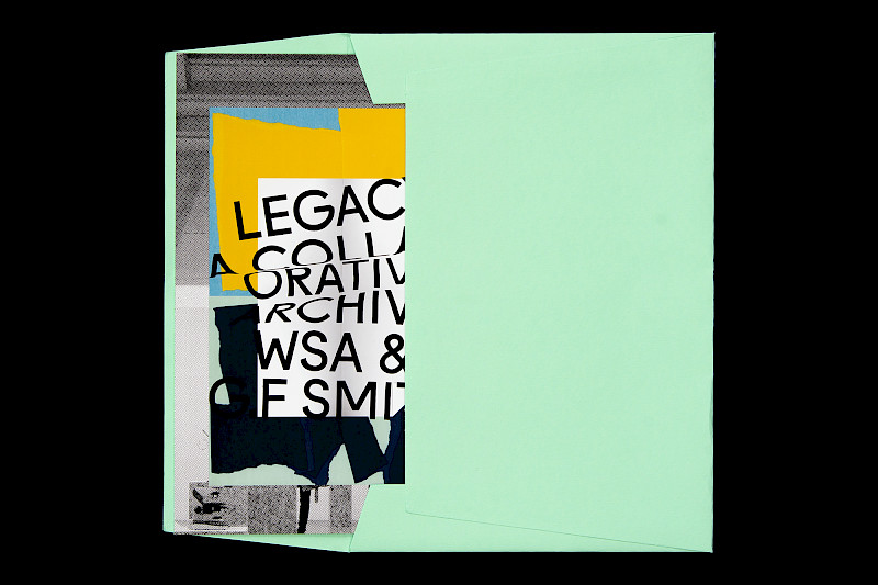
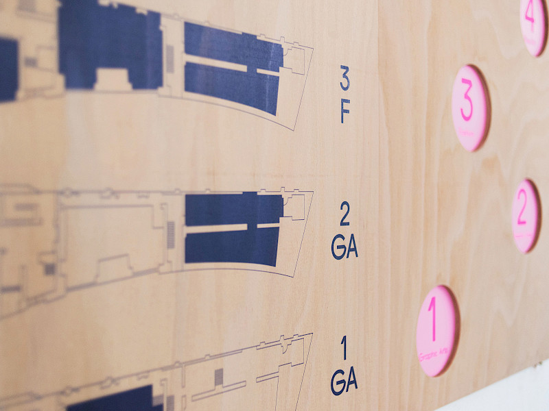
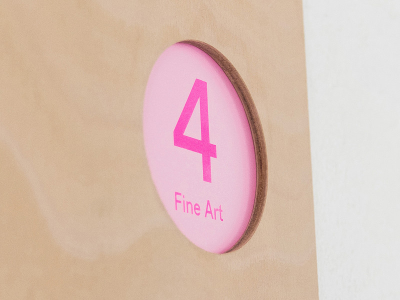
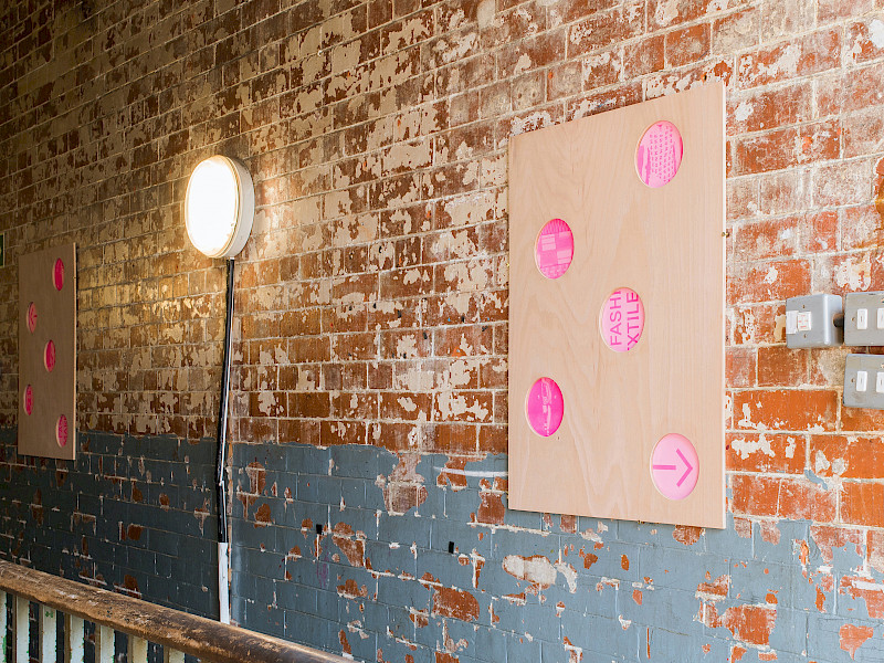
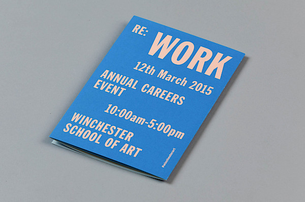
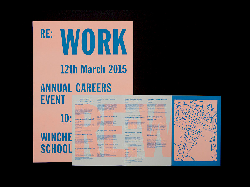
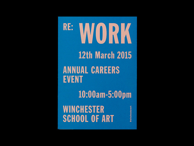
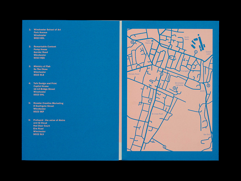
Deliverable(s): Invitations A5 (148 × 210 mm), Publications A5 (148 × 210 mm), A-boards A1 (420 × 594 mm), Social media, E-invite, Vinyl, Website
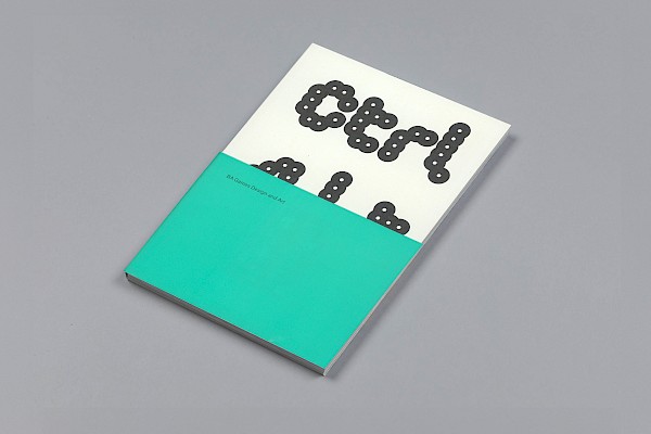
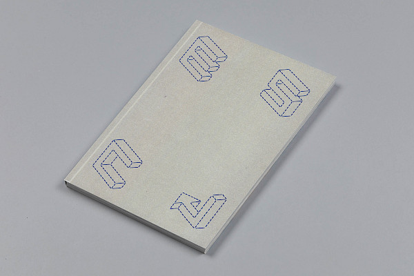
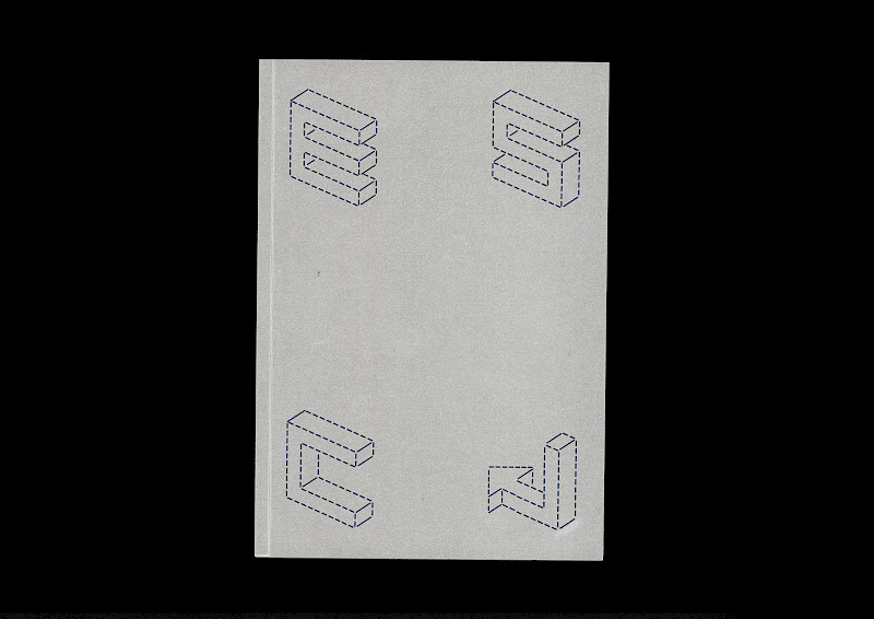
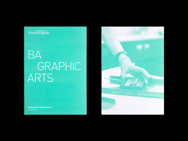
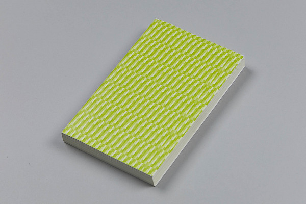
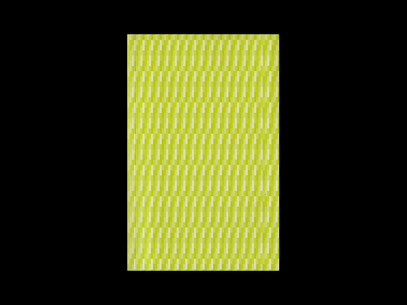
Typeface(s): Helvetica Neue Medium and Regular (by Max Miedinger for Linotype), The Neue Black (by Vocal Type)
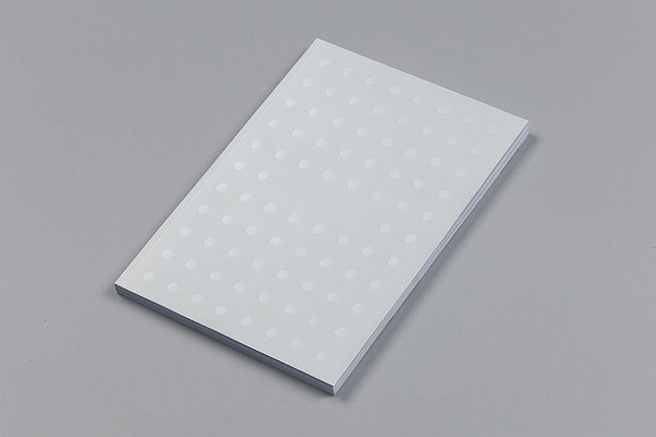
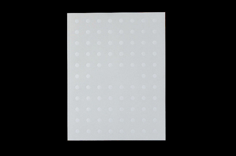
Paper(s): Cyclus Offset 300gsm and 135gsm (by Antalis)
Award: Finalist for ‘Design For Good’, Antalis Creative Power
Printers: PurePrint Group
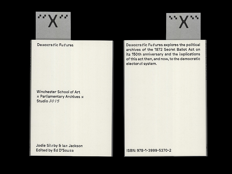
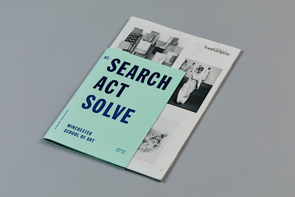
ISBN: 978-1-3999-2315-6
Binding: Spiral bound, Caromer
Edited by: Prof. Ed D’Souza
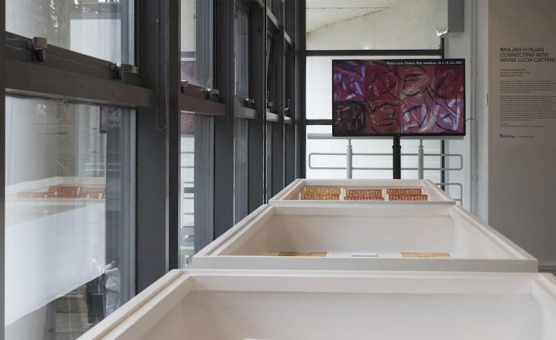
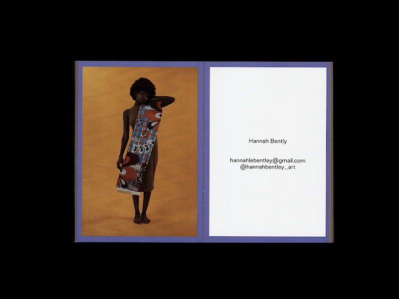
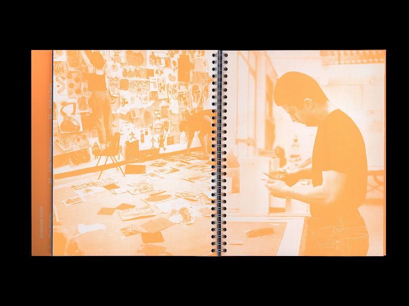
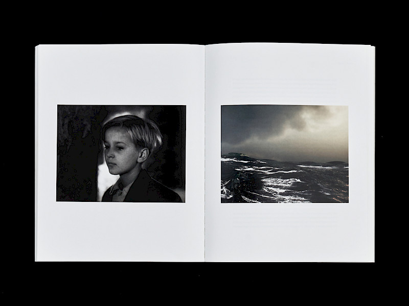
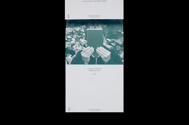
Photography: Dave Gibbons
Tag(s): Protest, Publication, Typography, Decolonisation, Community, Historic, Political, Speculative, Digital, Pedagogy, Society, Identity, Exhibition, Diversity